
Section 11 Network Diffusion

In the social and behavioral sciences, network models and empirical networks have frequently been used to investigate diffusion processes. Diffusion in this contexts refers to the spread of social or biological contagions (diseases, technological innovations, memes, rumors, etc.) among individuals or larger groups in a given a social context. Work in this realm has shown that social networks with different topological properties can lead to very different kinds of diffusion trajectories in terms of the speed and completeness with which such contagions spread. In this section, we introduce a few simple network diffusion models and demonstrate how they can be used with common forms of archaeological network data or to address general archaeological questions.
11.1 Diffusion Processes
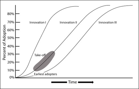
Network diffusion processes are frequently investigated using simulation methods. Specifically, a researcher starts with a network either generated based on empirical data or modeled on some generative process (like a random or small world network) and then introduces a social contagion of some sort into one or more nodes in the network. This network is then walked through a series of time steps (which could represent hours, days, years or whatever length of time is appropriate for the given question) and the contagion spreads from node to node with some probability based on the configuration and strength of connections among the nodes and potentially some other features such as the susceptibility of a given node based on non-network attributes. Such simulations can be repeated many times with a given network configuration and then the nature of the diffusion process can be examined in the resulting data which might include estimates of the rate of infection/adoption, the proportion of nodes that take on the contagion across each time step, or the order in which nodes are infected/adopt among many other possibilities. Typically, researchers are interested in identifying specific features of the infection/adoption curve, specific directions of spread, or other aggregate features of the diffusion process to compare to other empirical information or theoretical expectations. For example, empirical research on the diffusion of technological innovations has shown that adoption rates are often characterized by an S-shaped curve where adoption rates are initially slow until an innovation reaches some threshold, which is followed by rapid adoption and then eventually a leveling off as the adoption rate reaches saturation within a given population. Using network simulation as described here, it is possible to compare how different network configurations relate to such expectations.
11.2 Simulating Network Diffusion in R
In this section we introduce basic methods for simulating network diffusion process on empirical and model based network configurations in R.
For the analyses here, we largely rely on a package called
netdiffuseR which includes built-in functions for
simulating many common topological forms of networks such as random or
small-world networks and also allows us to estimate diffusion rates and
directions across nodes across time steps. Importantly, this package
allows for consideration of both empirical and simulated networks as the
starting point.
Let’s get started by initializing our library and exploring the primary function within this package called rdiffnet. This function can take a number of arguments to specify the nature of the network to be created and the diffusion process to be simulated on that network. These arguments include:
-
n - The number of nodes to include in the network. If you supply a
seed.graphthis argument is not needed. - t - the number of time steps to consider.
- seed.graph - An optional argument that lets you supply an empirical network in the form of an adjacency matrix to serve as the initial network configuration.
-
seed.nodes - This argument can be set to either
marginal,central, orrandomand this refers to the positions of the initial nodes to be “infected” or “adopters” in the network model. These options will select nodes with either the lowest degree, highest degree, or randomly respectively. Alternatively, you can supply a vector of node numbers representing the nodes which should be adopters in time step 1. - seed.p.adopt - This is the proportion of nodes that will be initial adopters/infected.
-
rgraph.args - This argument includes arguments that are further passed to the
rgraphfunction to define the parameters of the random graph to be created (if this is relevant). -
rewire - This logical argument expects a
TRUEorFALSE. IfTRUEat each time step a number of edges will be reassigned at random based on additional options passed to therewire.argsargument. Note that this argument isTRUEby default. -
rewire.args - This argument is used to send options to the
rewire_graphfunction which rewires a certain number of edges at each step. In general the most relevant option ispwhich is the proportion of edges that should be rewired. -
threshold.dist - This argument expects either a function or a vector of length
nthat defines the adoption threshold (susceptibility) of each node. -
exposure.args - This argument contains options passed to the
exposurefunction which defines adoption rates for various kinds of network edge weighting schema.
As we will see below, we do not need to use all of these arguments in every network simulation. Reading the documentation of the rdiffnet package provides additional details on options described briefly here.
One important concept that needs to be formally defined before we move on is the network threshold (defined in relationship to \(\tau\) or threshold.dist). This can be formally written as:
\[ a_i = \left\{\begin{array}{ll} 1 &\mbox{if } \tau_i\leq E_i \\ 0 & \mbox{Otherwise} \end{array}\right. \qquad E_i \equiv \frac{\sum_{j\neq i}\mathbf{X}_{ij}a_j}{\sum_{j\neq i}\mathbf{X}_{ij}} \]
where
- \(\tau\) is the proportion of neighbors who need to be adopters for the target to adopt.
- \(E_i\) is exposure where \(\mathbf{X}\) is the adjacency matrix of the network.
In other words, node \(i\) will adopt at a given time step if exposure is greater than or equal to \(\tau\).
11.2.1 Simulated Networks
We start with a simple random small-world network simulation to show how this function works. Let’s run the code and then we’ll explain what is happening:
library(netdiffuseR)

set.seed(4436)
net_test1 <- rdiffnet(
  n = 1000,
  t = 20,
  seed.nodes = "random",
  seed.p.adopt = 0.001,
  seed.graph = "small-world",
  rgraph.args = list(p = 0.1),
  threshold.dist = function (x) runif(1, 0.1, 0.5)
)

summary(net_test1)
## Diffusion network summary statistics
## Name : A diffusion network
## Behavior : Random contagion
## -----------------------------------------------------------------------------
## Period Adopters Cum Adopt. (%) Hazard Rate Density Moran's I (sd)
## -------- ---------- ---------------- ------------- --------- ----------------
## 1 1 1 (0.00) - 0.00 -0.00 (0.00)
## 2 4 5 (0.00) 0.00 0.00 0.10 (0.01) ***
## 3 6 11 (0.01) 0.01 0.00 0.16 (0.01) ***
## 4 9 20 (0.02) 0.01 0.00 0.18 (0.01) ***
## 5 13 33 (0.03) 0.01 0.00 0.18 (0.01) ***
## 6 25 58 (0.06) 0.03 0.00 0.20 (0.01) ***
## 7 39 97 (0.10) 0.04 0.00 0.24 (0.01) ***
## 8 71 168 (0.17) 0.08 0.00 0.19 (0.01) ***
## 9 124 292 (0.29) 0.15 0.00 0.20 (0.01) ***
## 10 167 459 (0.46) 0.24 0.00 0.21 (0.01) ***
## 11 197 656 (0.66) 0.36 0.00 0.18 (0.01) ***
## 12 186 842 (0.84) 0.54 0.00 0.16 (0.01) ***
## 13 111 953 (0.95) 0.70 0.00 0.10 (0.01) ***
## 14 41 994 (0.99) 0.87 0.00 0.03 (0.01) ***
## 15 6 1000 (1.00) 1.00 0.00 -
## 16 0 1000 (1.00) 0.00 0.00 -
## 17 0 1000 (1.00) 0.00 0.00 -
## 18 0 1000 (1.00) 0.00 0.00 -
## 19 0 1000 (1.00) 0.00 0.00 -
## 20 0 1000 (1.00) 0.00 0.00 -
## -----------------------------------------------------------------------------
## Left censoring : 0.00 (1)
## Right centoring : 0.00 (0)
## # of nodes : 1000
##
## Moran's I was computed on contemporaneous autocorrelation using 1/geodesic
## values. Significane levels *** <= .01, ** <= .05, * <= .1.In this example, we have created a random network with 1000 nodes and small world structure. We examine the network across 20 time steps. We send a value of 0.1 to the rgraph.args argument meaning that proportion of ties will be rewired in the random graph to generate “small-world” structure (see rgaph_ws for more info) in the initial network configuration. We set the initial adopters in the network to 0.001 or a single node in this 1000 node network. Finally, we set the threshold.dist to be a random uniform number (using the runif function) between 0.1 and 0.5 meaning that a node will adopt the contagion at a given time step if between 10% and 50% of it’s neighbors have adopted. Note that we have not set a value for rewire so by default this is TRUE and a small proportion of edges will be rewired at each time step.
The summary output provides information on the number of adopters and the cumulative adoption percent at each time step. We also have information on the hazard rate, which is the probability that a given node will be infected/adopt at each step. The Moran’s I is a measure of autocorrelation which here is sued to indicate whether infected nodes/adopters are concentrated among neighbors in the network (nodes that share an edge). Not surprisingly, we see they are across all but the first time step.
The netdiffuseR package also has built in functions for plotting. First, let’s plot our simulated network at a few different time steps to see the distributions of adopters and non-adopters. Here we plot the 1st, 10th, and 15th time steps:
plot_diffnet(net_test1, slices = c(1, 10, 15))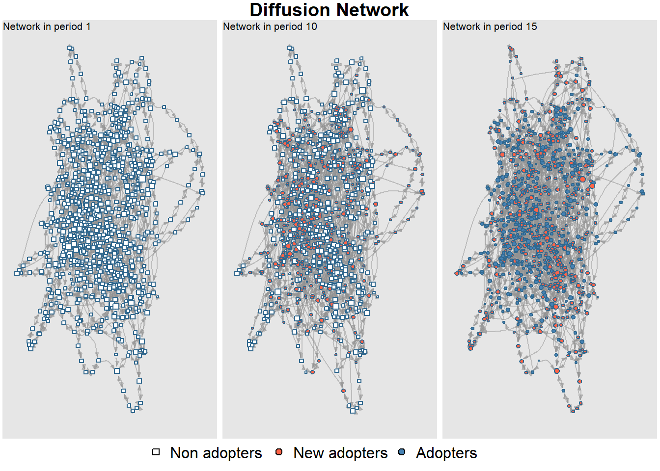
We can also plot the adoption curve across all time steps using the plot_adopters function:
plot_adopters(net_test1)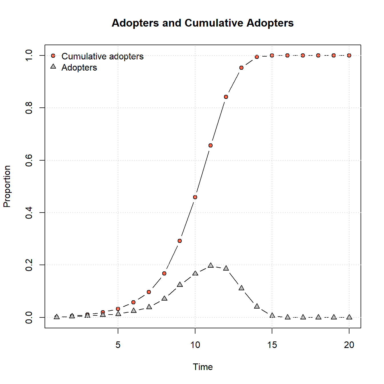
These results show the classic S-shaped curve for cumulative adoption with the parameters we’ve provided where adoption is at first slow, followed by a period of rapid adoption, and then a gradual slowdown as adoptions reaches saturation.
We can also plot a network that shows the time step at which each node adopted the contagion:
plot_diffnet2(net_test1)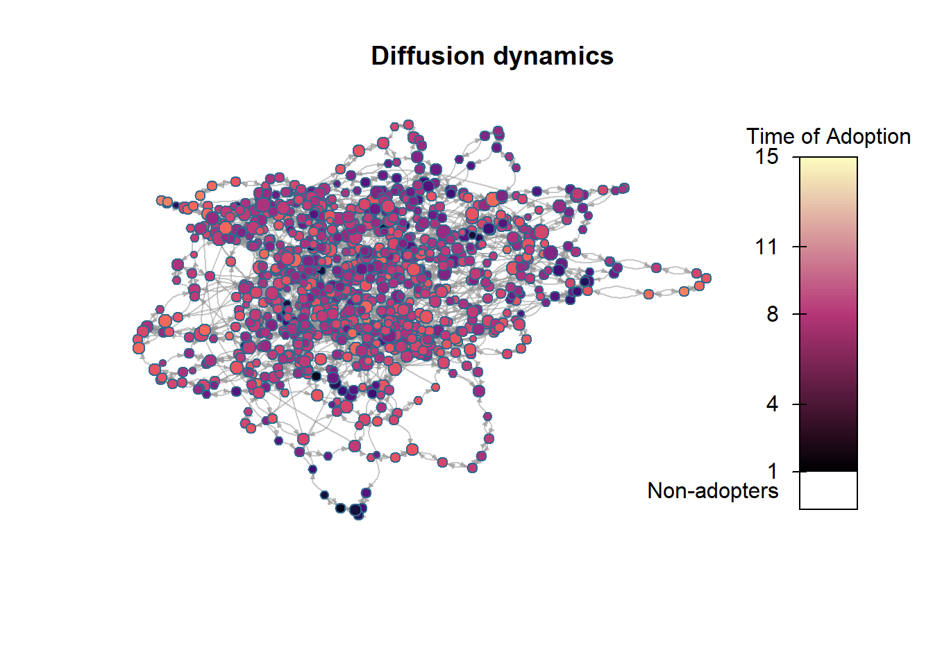
Using the rdiffnet function and altering the arguments, we can experiment with how different configurations of parameters change the rate or completeness of adoption. For example, in the chunk of code below we replicate the model above exactly except that we allow for some nodes to have a higher threshold required for adoption (70% of nodes as the max instead of 50%). Let’s see how that changes our results:
set.seed(4436)
net_test2 <- rdiffnet(
  n = 1000,
  t = 20,
  seed.nodes = "random",
  seed.p.adopt = 0.001,
  seed.graph = "small-world",
  rgraph.args = list(p = 0.1),
  threshold.dist = function (x) runif(1, 0.1, 0.7)
)

summary(net_test2)
## Diffusion network summary statistics
## Name : A diffusion network
## Behavior : Random contagion
## -----------------------------------------------------------------------------
## Period Adopters Cum Adopt. (%) Hazard Rate Density Moran's I (sd)
## -------- ---------- ---------------- ------------- --------- ----------------
## 1 1 1 (0.00) - 0.00 -0.00 (0.00)
## 2 4 5 (0.00) 0.00 0.00 0.10 (0.01) ***
## 3 3 8 (0.01) 0.00 0.00 0.14 (0.01) ***
## 4 5 13 (0.01) 0.01 0.00 0.17 (0.01) ***
## 5 2 15 (0.01) 0.00 0.00 0.12 (0.01) ***
## 6 2 17 (0.02) 0.00 0.00 0.15 (0.01) ***
## 7 8 25 (0.02) 0.01 0.00 0.15 (0.01) ***
## 8 11 36 (0.04) 0.01 0.00 0.18 (0.01) ***
## 9 23 59 (0.06) 0.02 0.00 0.15 (0.01) ***
## 10 32 91 (0.09) 0.03 0.00 0.19 (0.01) ***
## 11 44 135 (0.14) 0.05 0.00 0.18 (0.01) ***
## 12 56 191 (0.19) 0.06 0.00 0.15 (0.01) ***
## 13 74 265 (0.26) 0.09 0.00 0.15 (0.01) ***
## 14 95 360 (0.36) 0.13 0.00 0.15 (0.01) ***
## 15 101 461 (0.46) 0.16 0.00 0.15 (0.01) ***
## 16 82 543 (0.54) 0.15 0.00 0.13 (0.01) ***
## 17 92 635 (0.64) 0.20 0.00 0.12 (0.01) ***
## 18 86 721 (0.72) 0.24 0.00 0.13 (0.01) ***
## 19 69 790 (0.79) 0.25 0.00 0.14 (0.01) ***
## 20 45 835 (0.83) 0.21 0.00 0.14 (0.01) ***
## -----------------------------------------------------------------------------
## Left censoring : 0.00 (1)
## Right centoring : 0.16 (165)
## # of nodes : 1000
##
## Moran's I was computed on contemporaneous autocorrelation using 1/geodesic
## values. Significane levels *** <= .01, ** <= .05, * <= .1.
plot_adopters(net_test2)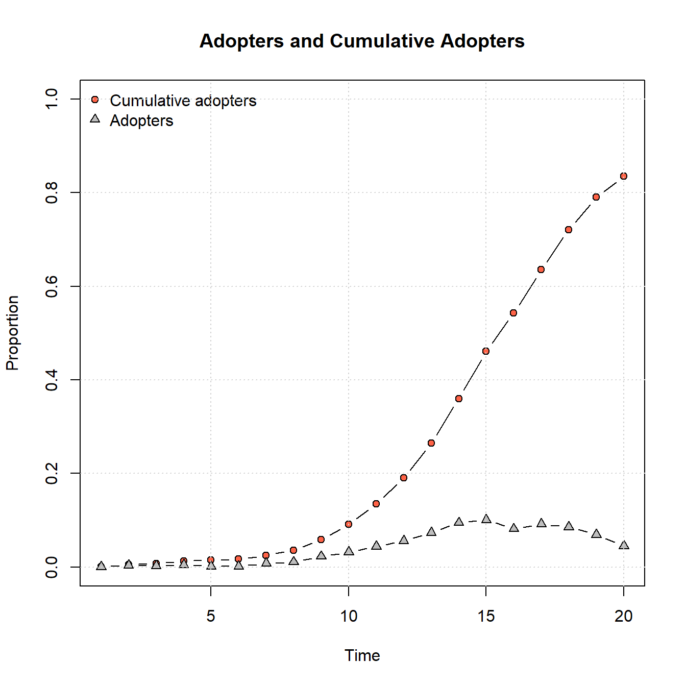
plot_diffnet2(net_test2)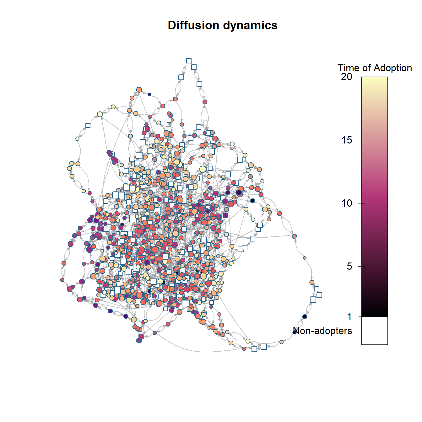
As this shows, by changing that simple parameter to allow for a higher adoption threshold for some nodes, we no longer get saturation within the same 20 time steps and we see a generally slower rate of adoption.
We could also explore alternate graph generation models using this approach. In the example below, we generate a scale-free network using the rgraph_ba function (ba for Barabasi and Albert who defined this model). We set the parameter m = 4 which means that 4 edges will be created for each node in the initial network. We leave all other parameters as they were in our initial example.
set.seed(4436)
net_test2 <- rdiffnet(
  n = 1000,
  t = 20,
  seed.nodes = "random",
  seed.p.adopt = 0.001,
  seed.graph = "scale-free",
  rgraph.args = list(m = 4),
  threshold.dist = function (x) runif(1, 0.1, 0.5)
)

summary(net_test2)
## Diffusion network summary statistics
## Name : A diffusion network
## Behavior : Random contagion
## -----------------------------------------------------------------------------
## Period Adopters Cum Adopt. (%) Hazard Rate Density Moran's I (sd)
## -------- ---------- ---------------- ------------- --------- ----------------
## 1 1 1 (0.00) - 0.00 -0.00 (0.00)
## 2 1 2 (0.00) 0.00 0.00 0.00 (0.00) ***
## 3 2 4 (0.00) 0.00 0.00 0.01 (0.00) ***
## 4 3 7 (0.01) 0.00 0.00 0.02 (0.00) ***
## 5 3 10 (0.01) 0.00 0.00 0.01 (0.00) ***
## 6 5 15 (0.01) 0.01 0.00 0.02 (0.00) ***
## 7 5 20 (0.02) 0.01 0.00 0.01 (0.00) ***
## 8 9 29 (0.03) 0.01 0.00 0.01 (0.00) ***
## 9 13 42 (0.04) 0.01 0.00 0.02 (0.00) ***
## 10 17 59 (0.06) 0.02 0.00 0.01 (0.00) ***
## 11 71 130 (0.13) 0.08 0.00 0.01 (0.00) ***
## 12 189 319 (0.32) 0.22 0.00 0.01 (0.00) ***
## 13 385 704 (0.70) 0.57 0.00 0.01 (0.00) ***
## 14 273 977 (0.98) 0.92 0.00 0.00 (0.00)
## 15 23 1000 (1.00) 1.00 0.00 -
## 16 0 1000 (1.00) 0.00 0.00 -
## 17 0 1000 (1.00) 0.00 0.00 -
## 18 0 1000 (1.00) 0.00 0.00 -
## 19 0 1000 (1.00) 0.00 0.00 -
## 20 0 1000 (1.00) 0.00 0.00 -
## -----------------------------------------------------------------------------
## Left censoring : 0.00 (1)
## Right centoring : 0.00 (0)
## # of nodes : 1000
##
## Moran's I was computed on contemporaneous autocorrelation using 1/geodesic
## values. Significane levels *** <= .01, ** <= .05, * <= .1.
plot_adopters(net_test2)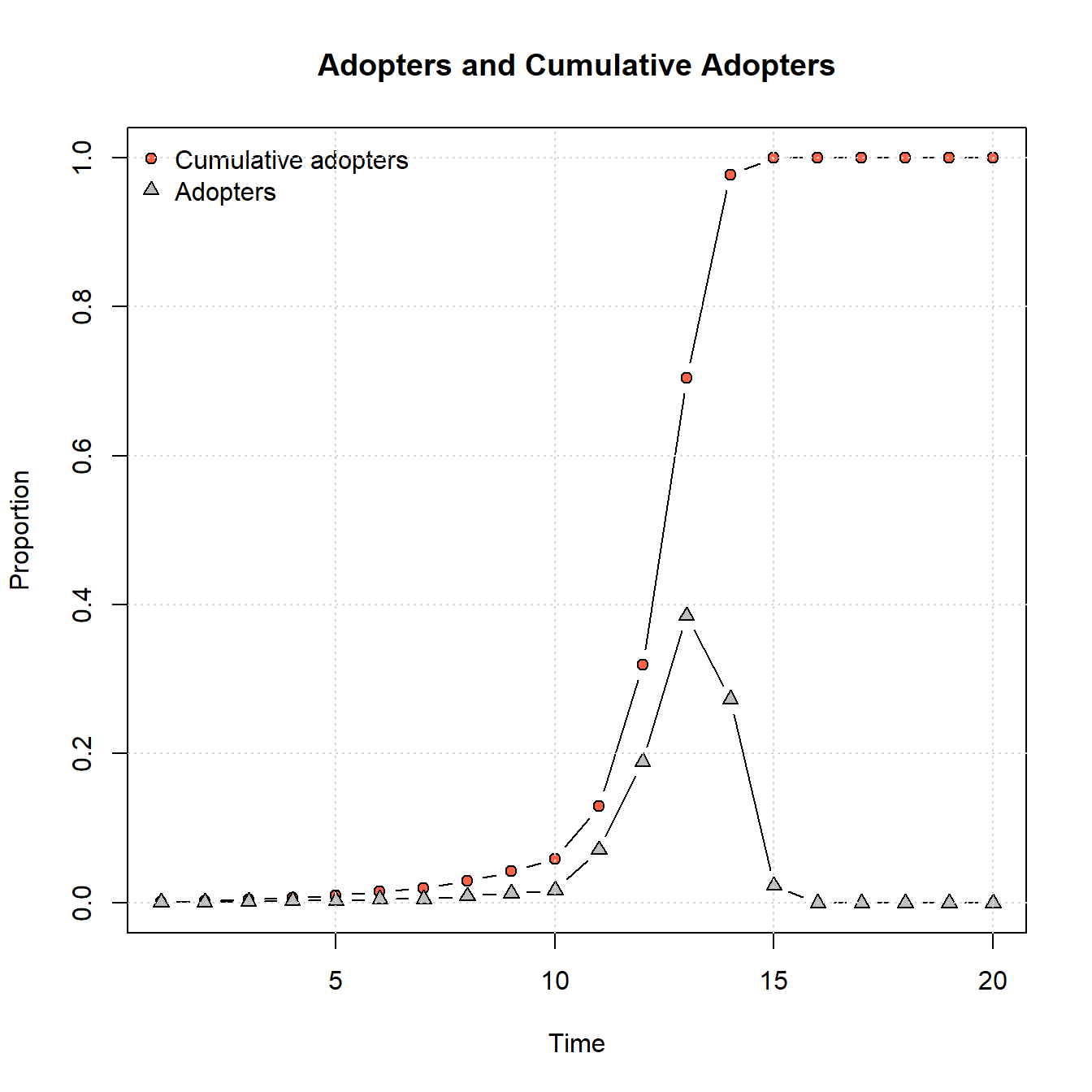
plot_diffnet2(net_test2)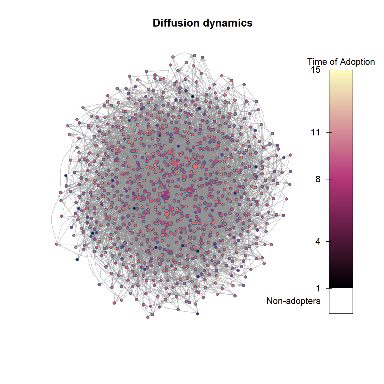
As the figures above show, the scale-free network model generates an adoption curve that is slow to grow and then shows a rapid cascade across the network and quick saturation in just a few time steps. As this suggests, these different forms of network topology likely lead to different kinds of adoption/infection processes. We could potentially use these curves and assessments of rates of uptakes from other empirical analyses to determine which sorts of network generative process are more or less plausible given our data.
11.2.2 Empirical Networks
The rdiffnet function described above can also be applied to empirical networks. By way of example, let’s take a look at the Iberian Roman Roads data set we’ve used in several places in this document. Here we define sites as nodes and connect them with edges when there is a documented road between them. We draw additional edges to nearest neighbors for all remaining unconnected nodes to create a single fully connected network. Download the network data here to follow along and download the basemap here.
First, let’s map the network labeling the nodes by number:
library(igraph)
library(ggmap)
library(sf)
library(dplyr)
library(ggrepel)

# Read in required data
load("data/road_networks.RData")
load("data/road_base.Rdata")

nodes <- nodes[match(V(road_net3)$name, nodes$Id), ]

# Convert name, lat, and long data into sf coordinates
locations_sf <-
  st_as_sf(nodes, coords = c("long", "lat"), crs = 4326)
coord1 <- do.call(rbind, st_geometry(locations_sf)) %>%
  tibble::as_tibble() %>%
  setNames(c("long", "lat"))

# Create data.frame of long and lat as xy coordinates
xy <- as.data.frame(coord1)
colnames(xy) <- c("x", "y")

# Extract edge list from network object for road_net
edgelist1 <- get.edgelist(road_net3)

# Create data frame of beginning and ending points of edges
edges1 <- as.data.frame(matrix(NA, nrow(edgelist1), 4))
colnames(edges1) <- c("X1", "Y1", "X2", "Y2")
for (i in seq_len(nrow(edgelist1))) {
  edges1[i,] <- c(nodes[which(nodes$Id == edgelist1[i, 1]), 3],
                  nodes[which(nodes$Id == edgelist1[i, 1]), 2],
                  nodes[which(nodes$Id == edgelist1[i, 2]), 3],
                  nodes[which(nodes$Id == edgelist1[i, 2]), 2])
}
# Plot ggmap object with network on top
ggmap(my_map) +
  geom_segment(data = edges1,
               aes(
                 x = X1,
                 y = Y1,
                 xend = X2,
                 yend = Y2
               ),
               size = 1) +
  geom_point(
    data = xy,
    aes(x, y),
    alpha = 0.8,
    col = "black",
    fill = "white",
    shape = 21,
    size = 3,
  ) +
  geom_text_repel(aes(x = x, y = y, label = row.names(xy)),
                  data = xy,
                  size = 3) +
  theme_void()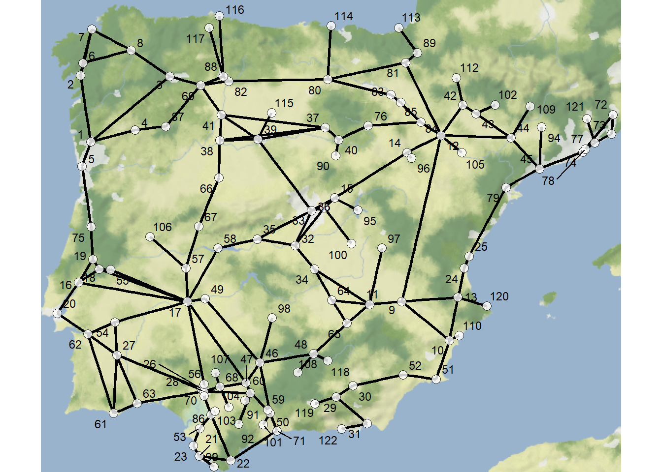
In order to use this network to model diffusion process, we simply have to supply it as the seed.graph within the rdiffnet function. In the following chunk of code, we supply the network shown above as the seed and model 20 time steps with the initial “adopters” in this case defined as nodes 72 and 77 in the far eastern portion of the study area. We define the threshold.dist as a vector where all values are 0.25 indicating that a node will adopt if a quarter of its connections have already adopted. Further, we set rewire = FALSE so that our edges will remain the same across all time steps. Let’s take a look at the network and the adopter plot:
set.seed(4435436)
diffnet_road <- rdiffnet(
  seed.graph = as.matrix(road_net3),
  t = 20,
  seed.nodes = c(72, 77),
  threshold.dist = rep(0.25, 122),
  rewire = FALSE
)

summary(diffnet_road)
## Diffusion network summary statistics
## Name : A diffusion network
## Behavior : Random contagion
## -----------------------------------------------------------------------------
## Period Adopters Cum Adopt. (%) Hazard Rate Density Moran's I (sd)
## -------- ---------- ---------------- ------------- --------- ----------------
## 1 2 2 (0.02) - 0.02 0.04 (0.01) ***
## 2 6 8 (0.07) 0.05 0.02 0.49 (0.02) ***
## 3 1 9 (0.07) 0.01 0.02 0.49 (0.02) ***
## 4 3 12 (0.10) 0.03 0.02 0.51 (0.02) ***
## 5 3 15 (0.12) 0.03 0.02 0.52 (0.02) ***
## 6 3 18 (0.15) 0.03 0.02 0.53 (0.02) ***
## 7 3 21 (0.17) 0.03 0.02 0.52 (0.02) ***
## 8 7 28 (0.23) 0.07 0.02 0.53 (0.02) ***
## 9 8 36 (0.30) 0.09 0.02 0.56 (0.02) ***
## 10 8 44 (0.36) 0.09 0.02 0.60 (0.02) ***
## 11 7 51 (0.42) 0.09 0.02 0.58 (0.02) ***
## 12 9 60 (0.49) 0.13 0.02 0.59 (0.02) ***
## 13 9 69 (0.57) 0.15 0.02 0.63 (0.02) ***
## 14 7 76 (0.62) 0.13 0.02 0.68 (0.02) ***
## 15 6 82 (0.67) 0.13 0.02 0.69 (0.02) ***
## 16 4 86 (0.70) 0.10 0.02 0.66 (0.02) ***
## 17 1 87 (0.71) 0.03 0.02 0.66 (0.02) ***
## 18 2 89 (0.73) 0.06 0.02 0.63 (0.02) ***
## 19 3 92 (0.75) 0.09 0.02 0.60 (0.02) ***
## 20 5 97 (0.80) 0.17 0.02 0.54 (0.02) ***
## -----------------------------------------------------------------------------
## Left censoring : 0.02 (2)
## Right centoring : 0.20 (25)
## # of nodes : 122
##
## Moran's I was computed on contemporaneous autocorrelation using 1/geodesic
## values. Significane levels *** <= .01, ** <= .05, * <= .1.
plot_adopters(diffnet_road)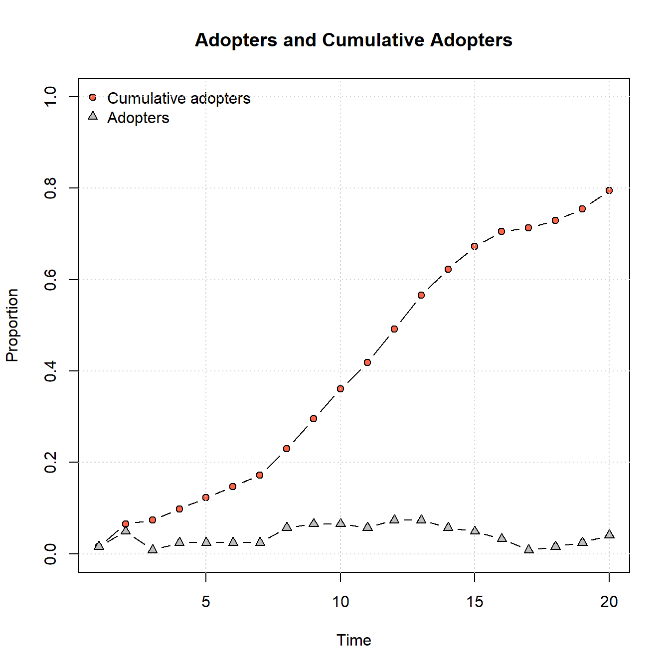
As the plot above shows, this network doesn’t reach saturation of adoption in the 20 time steps we give it but it is on an upward trajectory that is about the same slope from beginning to end. Let’s now consider the time of adoption for individual nodes. To do this, we can look at an object appended to the output of the rdiffnet function called toa or “time of adoption” which indicates which time step the node adopted.
diffnet_road$toa## n0 n73 n27 n77 n59 n1 n20 n70 n2 n64 n57 n46 n88 n3 n28 n4
## 14 15 13 14 15 15 15 14 8 8 13 7 7 8 9 18
## n16 n33 n52 n29 n5 n85 n15 n6 n86 n7 n83 n30 n8 n81 n60 n9
## 19 18 17 19 NA NA NA 6 5 NA NA NA 12 11 13 11
## n74 n75 n76 n78 n10 n42 n35 n38 n31 n11 n24 n12 n79 n13 n48 n23
## 11 12 12 10 11 12 12 10 12 6 5 4 3 NA 20 15
## n36 n47 n14 n17 n55 n69 n39 n19 n53 n54 n18 n72 n21 n40 n67 n22
## 20 NA 9 10 NA 20 19 20 15 13 NA NA NA 20 NA 13
## n84 n25 n49 n26 n80 n66 n32 n34 n44 n71 n37 n56 n41 n50 n43 n45
## 14 13 14 NA 12 NA NA 1 2 2 16 9 1 2 4 9
## n82 n61 n87 n51 n62 n63 n58 n65 n68 n89 n90 n91 n92 n93 n94 n95
## 8 10 10 8 9 NA 13 11 9 11 NA NA 2 4 10 9
## n96 n97 n98 n99 n100 n101 n102 n103 n104 n105 n106 n107 n108 n109 n110 n111
## 14 NA NA 11 NA 6 NA NA 8 16 NA 16 5 9 2 7
## n112 n113 n114 n115 n116 n117 n118 n119 n120 n121
## 10 10 13 12 12 16 13 8 2 14Let’s now plot a map of the network color coding nodes by this variable:
library(ggmap)
library(ggrepel)

ggmap(my_map) +
  # geom_segment plots lines by the beginning and ending
  # coordinates like the edges object we created above
  geom_segment(
    data = edges1,
    aes(
      x = X1,
      y = Y1,
      xend = X2,
      yend = Y2
    ),
    col = "black",
    size = 1
  ) +
  # plot site node locations
  geom_point(
    data = xy,
    aes(x, y, color = diffnet_road$toa),
    alpha = 0.8,
    shape = 16,
    size = 3,
  ) +
  scale_color_viridis_c(option = "plasma") +
  geom_text_repel(aes(x = x, y = y, label = row.names(xy)),
                  data = xy,
                  size = 3) +
  theme_void()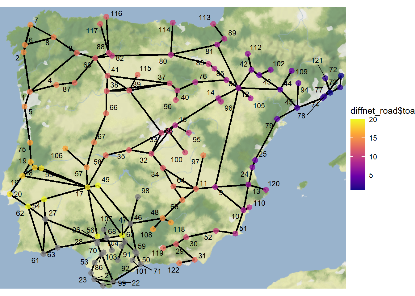
As this map illustrates, nodes closest to the initial adopters are the earliest adopters. Further the area in the southern portion of the study area shows a dense collection of nodes colored gray indicating they did not adopt in the 20 time steps we assessed.
Let’s now create another adopter plot and map color coded by time of adoption. In the next example, we leave everything alone but this time set the initial adopters as nodes 6 and 7 in the northwestern portion of the study area:
set.seed(44336)
diffnet_road <- rdiffnet(
  seed.graph = as.matrix(road_net3),
  t = 20,
  seed.nodes = c(6, 7),
  threshold.dist = rep(0.25, 122),
  rewire = FALSE
)

plot_adopters(diffnet_road)
ggmap(my_map) +
  # geom_segment plots lines by the beginning and ending
  # coordinates like the edges object we created above
  geom_segment(
    data = edges1,
    aes(
      x = X1,
      y = Y1,
      xend = X2,
      yend = Y2
    ),
    col = "black",
    size = 1
  ) +
  # plot site node locations
  geom_point(
    data = xy,
    aes(x, y, color = diffnet_road$toa),
    alpha = 0.8,
    shape = 16,
    size = 3,
  ) +
  scale_color_viridis_c(option = "plasma") +
  geom_text_repel(aes(x = x, y = y, label = row.names(xy)),
                  data = xy,
                  size = 3) +
  theme_void()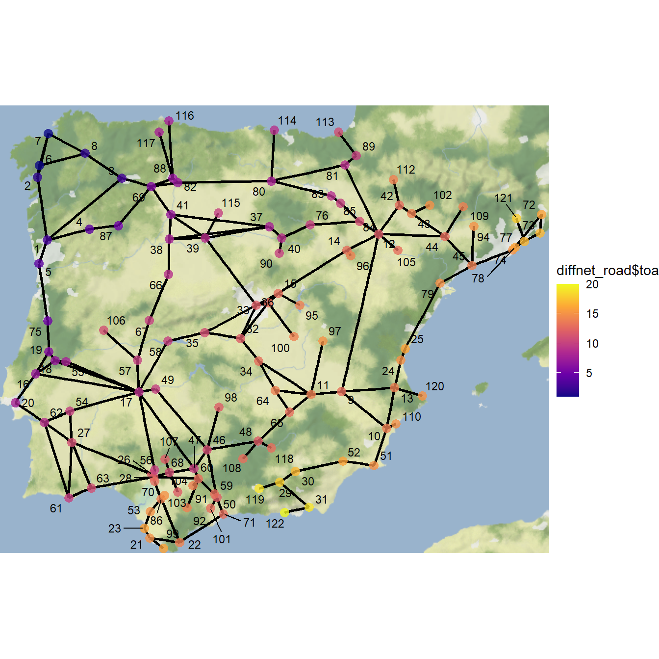
Using this starting point, we get a fairly typical S-shaped curve and full saturation of adoption within 20 time steps. As this shows, the specific location within a network where the innovation/meme/disease/contagion originates can have a big impact on the rate and completeness of spread, even when considering the same network.
11.3 Evaluating Diffusion Models
Frequently, when evaluating diffusion processes in empirical networks, the goal is to compare a formal model or simulation of a diffusion process to other empirical information we have regarding nodes, edges, or network level metrics. To provide an example of what this can look like, we use the Chaco World data and specifically the minimum distance network created in the Spatial Networks section which defined edges among Chacoan architectural complexes (ca. A.D. 1050-1150) within 36 kilometers of each other (which represents a one day walk on foot). The period in question is the peak distribution of Chacoan complexes across the region. We have added one additional attribute to this data set which is the beginning and ending date of each Chacoan complex. We will use this information to evaluate our diffusion models below. Download the data here to follow along.
Let’s start by loading in the data and mapping it:
library(igraph)
library(ggmap)
library(sf)
library(dplyr)

load(file = "data/Chaco_net.Rdata")

chaco_map <- ggmap(base, darken = 0.15) +
  geom_segment(
    data = edges,
    aes(
      x = X1,
      y = Y1,
      xend = X2,
      yend = Y2
    ),
    col = "white",
    size = 0.10,
    show.legend = FALSE
  ) +
  geom_point(
    data = xy,
    aes(x, y),
    alpha = 0.65,
    size = 1,
    col = "red",
    show.legend = FALSE
  ) +
  theme_void()
chaco_map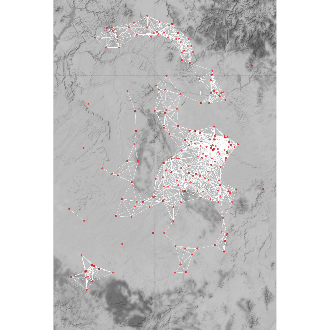
Next, we will create a diffusion network object using the rdiffnet function. In this plot we use the maximum distance network matrix (36 kilometers) called d36 as our seed.graph and we set our initial nodes to include all of the architectural complexes within Chaco Canyon, which is the core of the Chaco World and the location of the earliest formal Great Houses. We set the threshold distance such that nodes will adopt when they have at least one neighbor that has adopted and set rewire = FALSE. We run this model for 20 time steps.
Let’s run this function and take a look at the adopter plot:
chaco <- which(attr$CSN_macro_group == "Chaco Canyon")

set.seed(443)
diffnet_chaco <- rdiffnet(
  seed.graph = as.matrix(d36),
  t = 20,
  seed.nodes = chaco,
  threshold.dist = function(i) 1L,
  rewire = FALSE,
  exposure.args = list(normalized = FALSE)
)

summary(diffnet_chaco)
## Diffusion network summary statistics
## Name : A diffusion network
## Behavior : Random contagion
## -----------------------------------------------------------------------------
## Period Adopters Cum Adopt. (%) Hazard Rate Density Moran's I (sd)
## -------- ---------- ---------------- ------------- --------- ----------------
## 1 10 10 (0.04) - 0.08 0.08 (0.01) ***
## 2 40 50 (0.22) 0.19 0.08 0.42 (0.01) ***
## 3 23 73 (0.33) 0.13 0.08 0.46 (0.01) ***
## 4 29 102 (0.46) 0.19 0.08 0.56 (0.01) ***
## 5 13 115 (0.52) 0.11 0.08 0.59 (0.01) ***
## 6 13 128 (0.57) 0.12 0.08 0.62 (0.01) ***
## 7 20 148 (0.66) 0.21 0.08 0.62 (0.01) ***
## 8 25 173 (0.78) 0.33 0.08 0.64 (0.01) ***
## 9 12 185 (0.83) 0.24 0.08 0.64 (0.01) ***
## 10 5 190 (0.85) 0.13 0.08 0.64 (0.01) ***
## 11 6 196 (0.88) 0.18 0.08 0.66 (0.01) ***
## 12 3 199 (0.89) 0.11 0.08 0.73 (0.01) ***
## 13 0 199 (0.89) 0.00 0.08 0.73 (0.01) ***
## 14 0 199 (0.89) 0.00 0.08 0.73 (0.01) ***
## 15 0 199 (0.89) 0.00 0.08 0.73 (0.01) ***
## 16 0 199 (0.89) 0.00 0.08 0.73 (0.01) ***
## 17 0 199 (0.89) 0.00 0.08 0.73 (0.01) ***
## 18 0 199 (0.89) 0.00 0.08 0.73 (0.01) ***
## 19 0 199 (0.89) 0.00 0.08 0.73 (0.01) ***
## 20 0 199 (0.89) 0.00 0.08 0.73 (0.01) ***
## -----------------------------------------------------------------------------
## Left censoring : 0.04 (10)
## Right centoring : 0.11 (24)
## # of nodes : 223
##
## Moran's I was computed on contemporaneous autocorrelation using 1/geodesic
## values. Significane levels *** <= .01, ** <= .05, * <= .1.
plot_adopters(diffnet_chaco)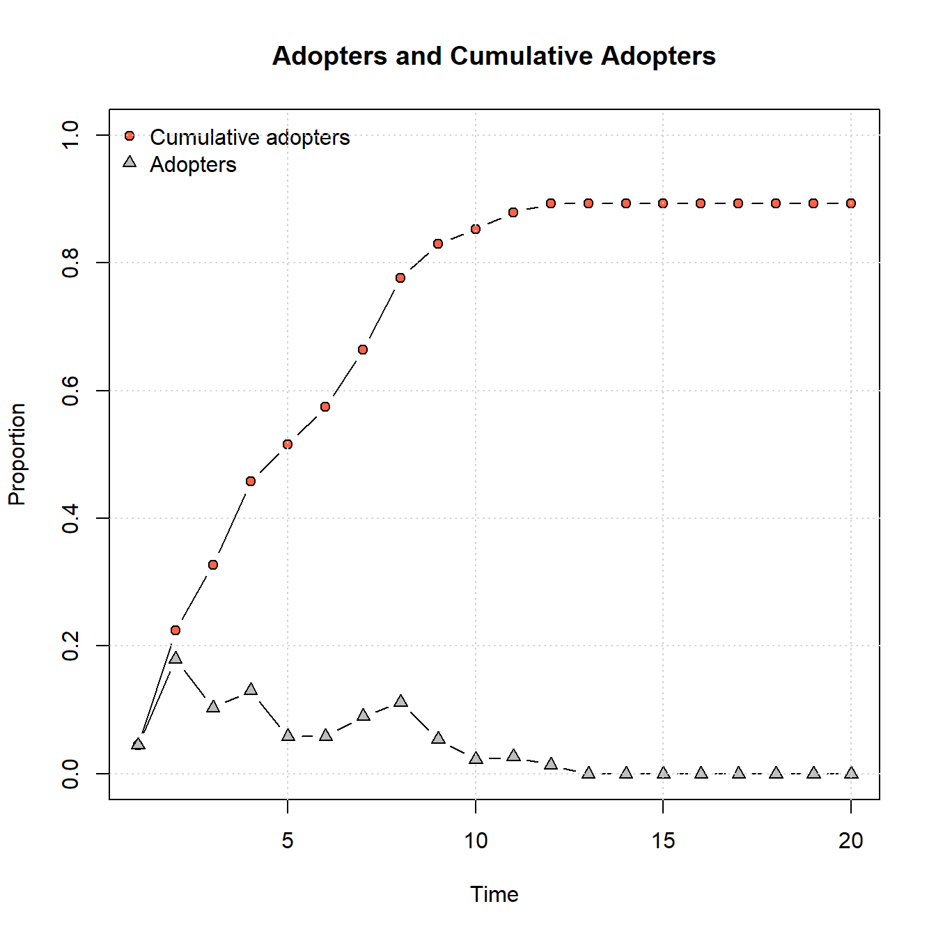
As this shows, the parameters provided lead to relatively quick adoptions followed by a leveling off. Notably, not all nodes adopt as there are some disconnected components within this network.
Now let’s take a look at a map color coded by time of adoption:
chaco_map2 <- ggmap(base, darken = 0.15) +
  geom_segment(
    data = edges,
    aes(
      x = X1,
      y = Y1,
      xend = X2,
      yend = Y2
    ),
    col = "white",
    size = 0.10,
    show.legend = FALSE
  ) +
  geom_point(
    data = xy,
    aes(x, y, color = diffnet_chaco$toa),
    alpha = 0.65,
    size = 2,
  ) +
  scale_color_viridis_c(option = "plasma") +
  theme_void()

chaco_map2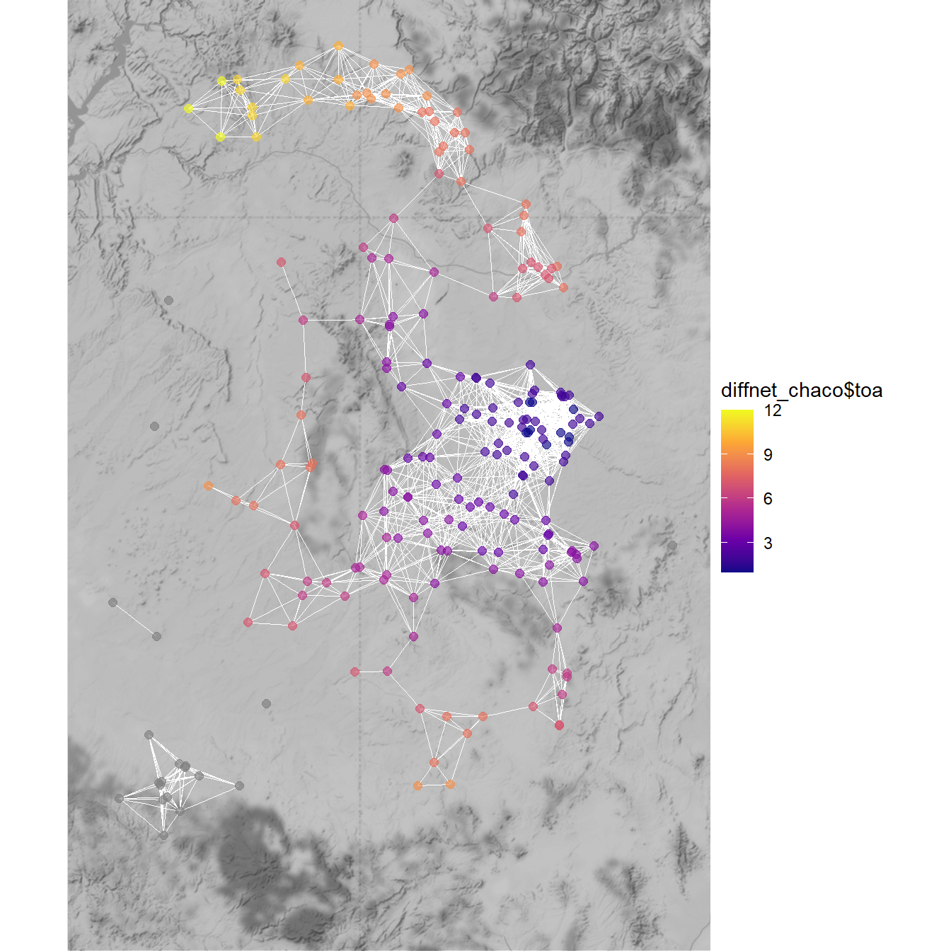
This map clearly shows a spatial pattern where sites to the south of Chaco Canyon are early adopters and then sites further to the north are relatively late adopters.
In order to evaluate this further we next want to assess the time of adoption for nodes in relation to other attribute data. one approach we can take is to use the classify function built into netdiffuseR to place nodes into a set of categories based on their time of adoption. These categories are: Early Adopters, Early Majority, Late Majority, Laggards and Non-Adopters.
toa_class <-
  factor(
    classify(diffnet_chaco)$toa,
    levels = c(
      "Early Adopters",
      "Early Majority",
      "Late Majority",
      "Laggards",
      "Non-Adopters"
    )
  )

table(toa_class)
## toa_class
## Early Adopters Early Majority Late Majority Laggards Non-Adopters
## 50 65 33 51 24Next, in order to investigate how these different adopters related to other node attributes we will create a data frame containing these toa_class values as well as the beginning dates of each site and then create box plot of beginning date by toa_class.
df <- data.frame(BeginDate = attr$Begin, Category = toa_class)

library(ggplot2)

ggplot(data = df) +
  geom_boxplot(aes(y = BeginDate, fill = Category)) +
  theme_bw()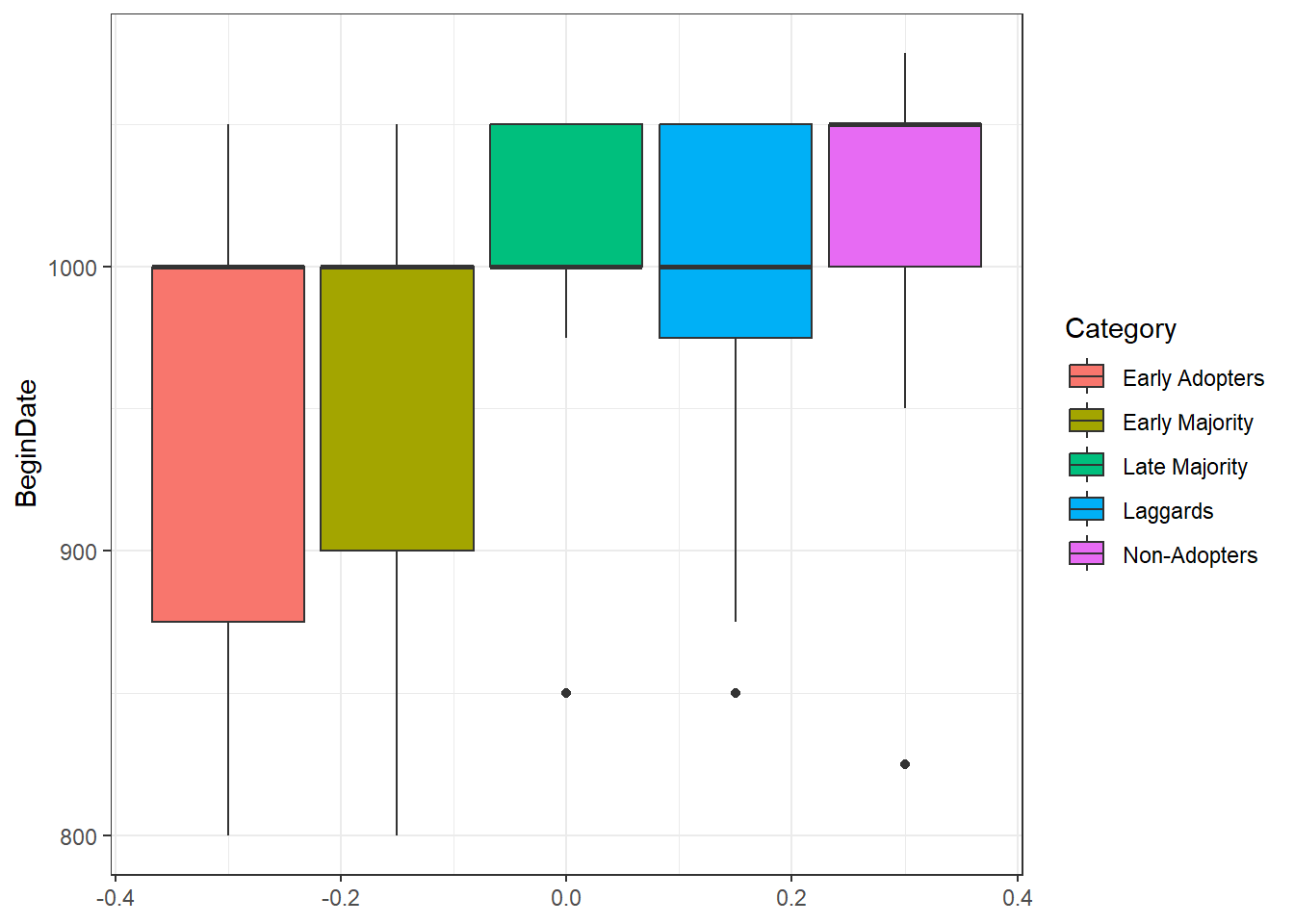
As this box plot illustrates, sites that were in the “Early Adopter” or “Early Majority” category include the vast majority of sites that have earlier starting dates though the median is the same across groups. This may suggest that network distance from Chaco Canyon (where we originated our “contagion” and where the earliest Great Houses are found) may have been a factor in the establishment of Chacoan complexes outside of Chaco. Of Course, if wanted to take this further we would need to assess the variable roles of spatial distance, network distance, and perhaps could even consider material cultural similarity data. At this point, however, this brief example at least points out that there is an interesting pattern worth investigation. Further, this example demonstrates one simple approach that could be used to compare diffusion models to other archaeological data.
We have only scratched the surface on the network methods that can be used to study diffusion here. There are many other advanced models that may be relevant for archaeological analysis including many interesting Epidemiological Models that would likely work well in archaeological context for considerations of all sorts of contagions (social or biological). We hope these brief examples will promote further exploration of such approaches.