
Section 9 Spatial Interaction Models

In the Spatial Networks section of this document we cover most of the simple network models for generating spatial networks based on absolute distance, configurations of locations, and territories. There is one general class of spatial network model that we described briefly in the Brughmans and Peeples (2023) book but did not cover in detail as the specifics require considerably more discussion. This includes a wide variety of spatial interaction models such as gravity models, truncated power functions, radiation models, and similar custom derivations of these approaches. In general, a spatial interaction model is a formal mathematical model that is used to predict the movement of people (or other sorts of entities) between origins and destinations. These models typically use information on the relative sizes or “attractiveness” of origins and destinations or other additional information on volumes of flows in and out. Such models have long been popular in geography, economics, and other fields for doing things like predicting the amount of trade between cities or nations or predicting or improving the location of services in a given geographic extent. Statistical spatial interaction models have been used in archaeology as well for both empirical and simulation studies (e.g., Bevan and Wilson 2013; Evans et al. 2011; Gauthier 2020; Paliou and Bevan 2016; Rihll and Wilson 1987) though they have not had nearly the impact they have had in other fields. We suggest that there is considerable potential for these models, in particular in contexts where we have other independent information for evaluating network flows across a study area.
In this section, we briefly outline a few common spatial interaction models and provide examples. For additional detailed overview and examples of these models there are several useful publications (see Evans et al. 2011; Rivers et al. 2011; and Amati et al. 2018).
9.1 Simple Gravity Models
We’ll start here with the very simple gravity model. This model is built on the notion that the “mass” of population at different origins and destinations creates attractive forces between them that is further influenced by the space and travel costs between them. This model takes many forms but the simplest can be written as:
\[x_{ij} = cv_iv_jf(d_{ij})\]
where
- \(x_{ij}\) is the number or strength of connection between nodes \(i\) and \(j\)
- \(c\) is a proportionality constant (gravitational constant) which balances the units of the formula. For our purposes we can largely ignore this value as it changes all absolute values but not relative values between nodes.
- \(v_i\) and \(v_j\) are attributes of nodes \(i\) and \(j\) contributing to their “mass” (attractiveness). This could be population or resource catchment or area or anything other factor that likely influences the attractiveness of the node in terms of the interaction that is the focus of the network.
- \(f(d_{ij})\) is the cost or “deterrence” function defining the travel costs between \(i\) and \(j\). Frequently, this cost function is further specified using inverse power law or exponential decay functions defined respectively by the equations below:
\[f(d_{ij}) = \frac{1}{(1+\beta d{ij})^\gamma} \text{ and } f(d_{ij}) = \frac{1}{e^{\beta d{ij}}}\]
where \(\beta\) is a scaling factor for both models sand \(\gamma\) determines the weight of the tail in the power law distribution.
There are numerous different configurations of the simple gravity model in the literature. Some versions add exponents to \(V_i\) or \(V_j\) to vary the importance of inflow and outflow independently, other versions use different derivations of deterrence, and many define inflows and outflows using different sources of empirical information with additional terms to scale the units. Calculating models like these is relatively easy but determining how to parameterize such models is typically the hard part as we discuss further below.
In order to demonstrate simple gravity models, we’re going to use a regional data set of Late Intermediate periods Wankarani sites in the Bolivian Altiplano provided online on the Comparative Archaeology Database at the University of Pittsburgh (McAndrews 2005). The details of this database and all of the variables are described at the link provided. This data set has more variables than we will use here but this provides a good example to explore because it includes location and size information for all sites.
First, let’s read in the data and create a quick plot showing site locations with points scaled by site area (as a measure of potential attractiveness and outflow potential). We will then select sites dating to the Late Intermediate period for analysis. We further limit consideration to habitation sites. Download the data here to follow along and download the base map here.
wankarani <- read.csv("data/Wankarani_siteinfo.csv")
wankarani <- wankarani[which(wankarani$Period == "Late Intermediate"), ]
wankarani <- wankarani[which(wankarani$Type == "habitation"), ]
load("data/bolivia.Rdata")

library(ggmap)
library(sf)

# Convert attribute location data to sf coordinates and change
# map projection
locations_sf <-
  st_as_sf(wankarani, coords = c("Easting", "Northing"), crs = 32721)
loc_trans <- st_transform(locations_sf, crs = 4326)
coord1 <- do.call(rbind, st_geometry(loc_trans)) %>%
  tibble::as_tibble() %>%
  setNames(c("lon", "lat"))

xy <- as.data.frame(coord1)
colnames(xy) <- c("x", "y")


# Plot original data on map
ggmap(base_bolivia, darken = 0.35) +
  geom_point(
    data = xy,
    aes(x, y, size = wankarani$Area),
    color = "red",
    alpha = 0.8,
    show.legend = FALSE
  ) +
  theme_void()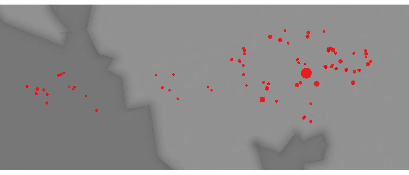
As this plot shows, there is one site that is considerably larger than the others and a few other clusters of large sites in the eastern portion of the study area.
Now we’re going to build a small function called grav_mod that includes 3 arguments:
-
attractwhich is the measure of settlement attractiveness in the network. In our example here we will use area as a measure of attractiveness for both the sending and receiving site, though this can be varied. -
Bwhich is our \(\beta\) parameter for the exponential decay cost function outlined above. -
dwhich is a matrix of distances among our nodes. Note that this could be something other than physical distance like travel time as well. It helps to have this in units that don’t result in very large numbers to keep the output manageable (though the actual absolute numbers don’t matter)
grav_mod <- function(attract, B, d) {
  res <- matrix(0, length(attract), length(attract))

  for (i in seq_len(length(attract))) {
    for (j in seq_len(length(attract))) {
      res[i, j] <-
        attract[i] * attract[j] * exp(-B * d[i,j])
    }
  }
  diag(res) <- 0
  return(res)
}
Now let’s try an example using the Wankarani data. For this first example we will set B to 1. We’ll take a look at the results by first, creating a heat map of the gravity model for every pair of nodes using the superheat package. We will then plot the site size against the estimated flow from our model with both axes transformed to base-10 logarithms to see how those variables relate. We use the packages scales to provide exponential notation for the axis labels.
# First calculate a distance matrix. We divide by
# 1000 so results are in kilometers.
d_mat <- as.matrix(dist(wankarani[, 5:6])) / 1000

test1 <-
  grav_mod(attract = wankarani$Area,
           B = 1,
           d = d_mat)

library(superheat)
superheat(test1)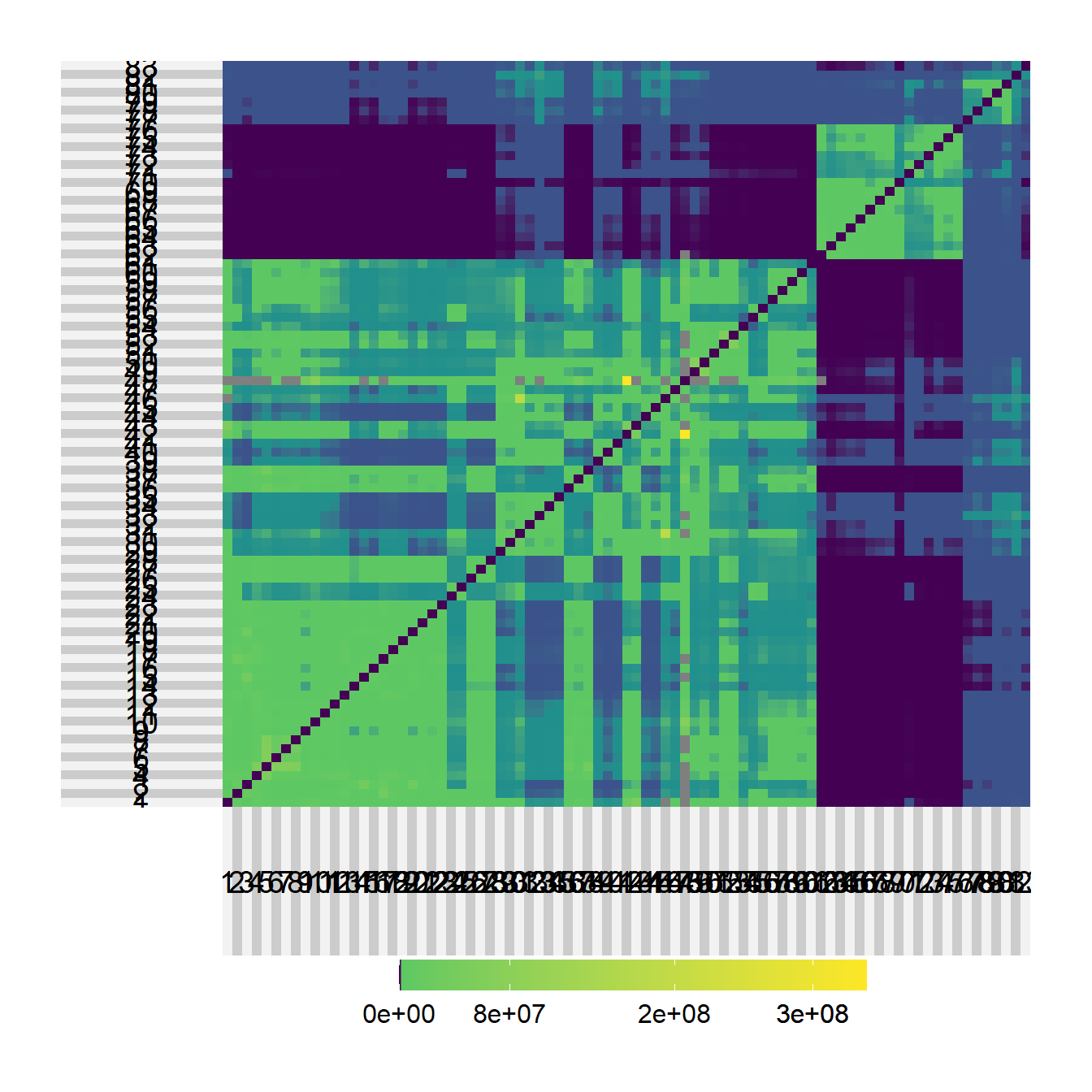
library(scales)
df <- data.frame(Flow = rowSums(test1), Area = wankarani$Area)

ggplot(data = df) +
  geom_point(aes(x = Area, y = Flow)) +
  scale_x_log10(
    breaks = trans_breaks("log10", function(x)
      10 ^ x),
    labels = trans_format("log10", math_format(10 ^ .x))
  ) +
  scale_y_log10(
    breaks = trans_breaks("log10", function(x)
      10 ^ x),
    labels = trans_format("log10", math_format(10 ^ .x))
  ) +
  theme_bw()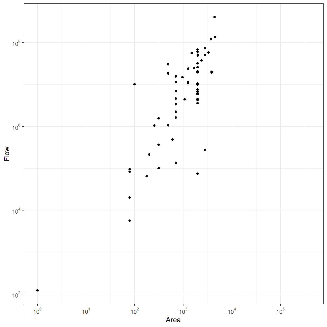
As these plots illustrate, there are clusters in the estimated flows among nodes, which is not surprising given that the sites themselves form a few clusters. Further, the plot comparing area to flow shows that there is a roughly positive linear relationship between the two but there is also variation with nodes with more or less flow than would be expected based on distance alone.
Next, let’s plot a network showing all connections scaled and colored based on their strength in terms of estimated flow and with nodes scaled based on weighted degree (the total volume of flow incident on that node). The blue colored ties are weaker and the yellow colored ties are stronger. For the sake of visual clarity we omit the 25% weakest edges.
library(statnet)
library(igraph)
library(ggraph)

sel_edges <- event2dichot(test1, method = "quantile", thresh = 0.25)
test1_plot <- test1 * sel_edges

net <-
  graph_from_adjacency_matrix(test1_plot, weighted = TRUE)

# Extract edge list from network object
edgelist <- get.edgelist(net)

# Create data frame of beginning and ending points of edges
edges <- data.frame(xy[edgelist[, 1], ], xy[edgelist[, 2], ])
colnames(edges) <- c("X1", "Y1", "X2", "Y2")

# Calculate weighted degree
dg_grav <- rowSums(test1) / 10000

# Plot data on map
ggmap(base_bolivia, darken = 0.35) +
  geom_segment(
    data = edges,
    aes(
      x = X1,
      y = Y1,
      xend = X2,
      yend = Y2,
      col = log(E(net)$weight),
      alpha = log(E(net)$weight)),
      show.legend = FALSE
    ) +
  scale_alpha_continuous(range = c(0, 0.5)) +
  scale_color_viridis() +
  geom_point(
    data = xy,
    aes(x, y, size = dg_grav),
    alpha = 0.8,
    color = "red",
    show.legend = FALSE
  ) +
theme_void() 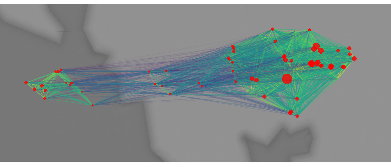
As this plot shows, there are areas characterized by higher and lower flow throughout this study area. The largest site in the study area (shown in the first map above) is characterized by a high weighted degree but there are other smaller sites that also have high weighted degree, especially in the eastern half of the study area.
Let’s now take a look at the same data again, this time we set B or \(\beta\) to 0.1.
# First calculate a distance matrix. We divide by
# 1000 so results are in kilometers.
d_mat <- as.matrix(dist(wankarani[, 5:6])) / 1000

test2 <-
  grav_mod(
    attract = wankarani$Area,
    B = 0.1,
    d = d_mat
  )

superheat(test2)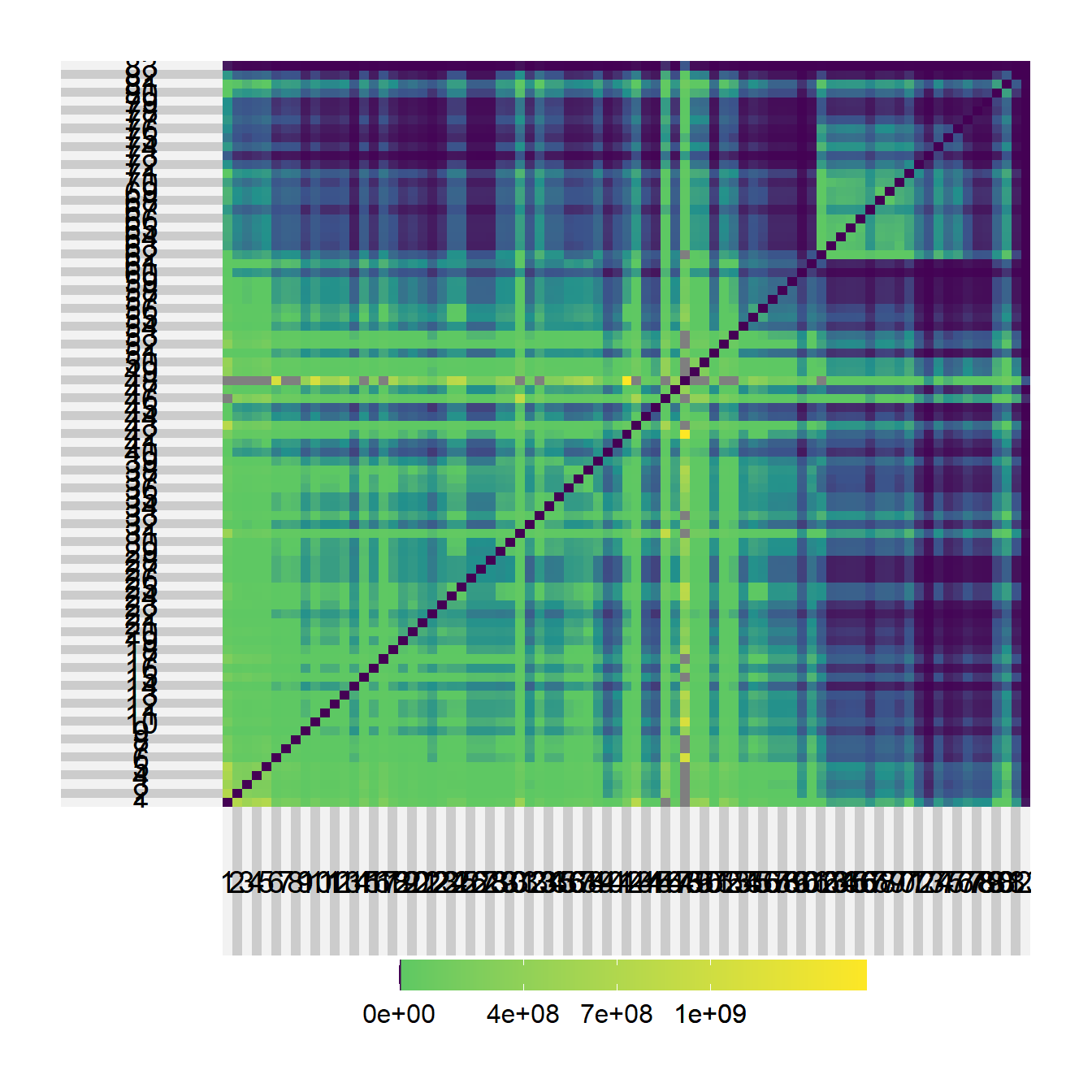
df <- data.frame(Flow = rowSums(test2), Area = wankarani$Area)

ggplot(data = df) +
  geom_point(aes(x = Area, y = Flow)) +
  scale_x_log10(
    breaks = trans_breaks("log10", function(x)
      10 ^ x),
    labels = trans_format("log10", math_format(10 ^ .x))
  ) +
  scale_y_log10(
    breaks = trans_breaks("log10", function(x)
      10 ^ x),
    labels = trans_format("log10", math_format(10 ^ .x))
  ) +
  theme_bw()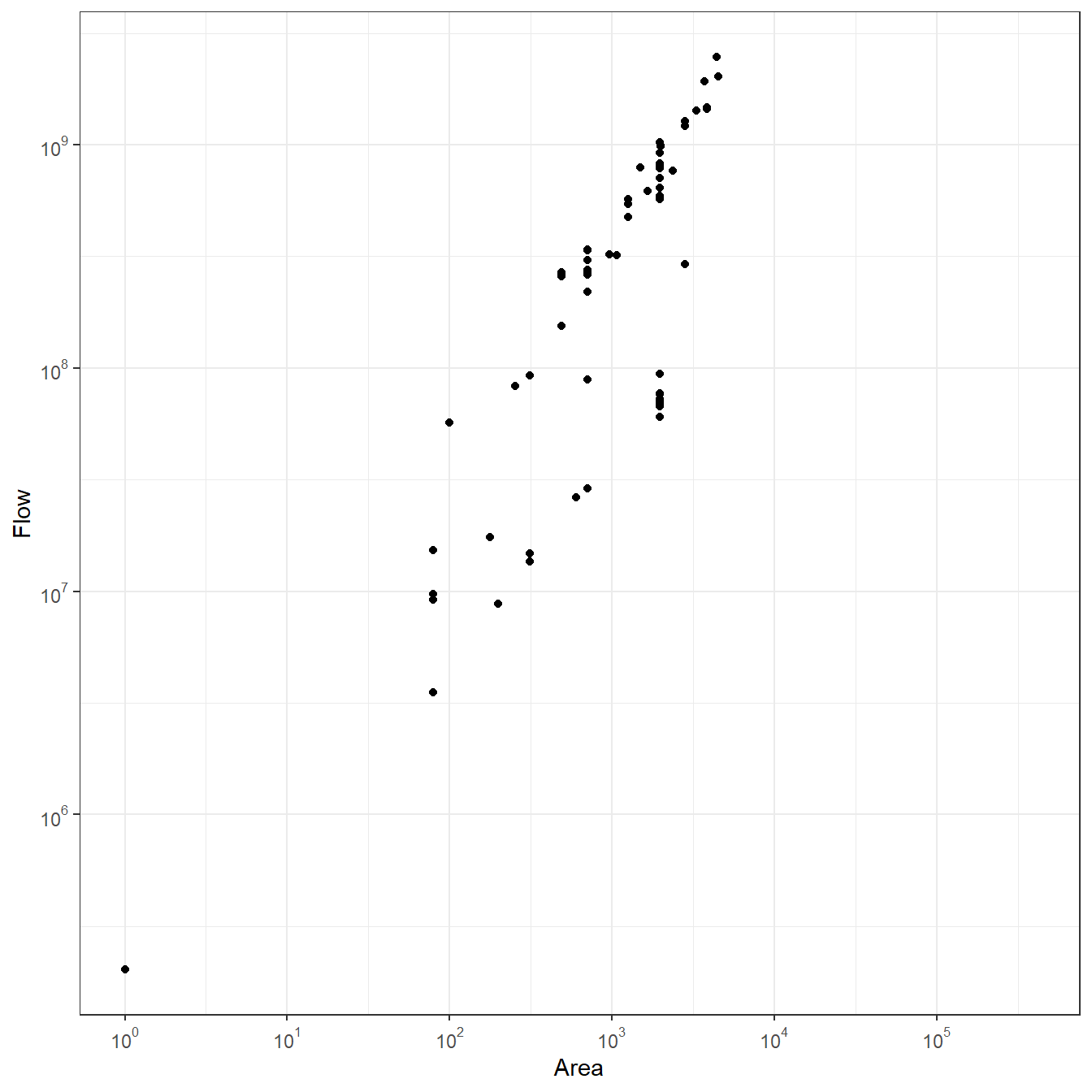
sel_edges <- event2dichot(test2, method = "quantile", thresh = 0.25)
test2_plot <- test2 * sel_edges

net2 <-
  graph_from_adjacency_matrix(test2_plot, mode = "undirected",
                              weighted = TRUE)

# Extract edge list from network object
edgelist <- get.edgelist(net2)

# Create data frame of beginning and ending points of edges
edges <- data.frame(xy[edgelist[, 1], ], xy[edgelist[, 2], ])
colnames(edges) <- c("X1", "Y1", "X2", "Y2")

# Calculate weighted degree
dg <- rowSums(test2) / 10000

# Plot data on map
ggmap(base_bolivia, darken = 0.35) +
  geom_segment(
    data = edges,
    aes(
      x = X1,
      y = Y1,
      xend = X2,
      yend = Y2,
      col = log(E(net2)$weight),
      alpha = log(E(net2)$weight)),
      show.legend = FALSE
    ) +
  scale_alpha_continuous(range = c(0, 0.5)) +
  scale_color_viridis() +
  geom_point(
    data = xy,
    aes(x, y, size = dg),
    alpha = 0.8,
    color = "red",
    show.legend = FALSE
  ) +
theme_void() 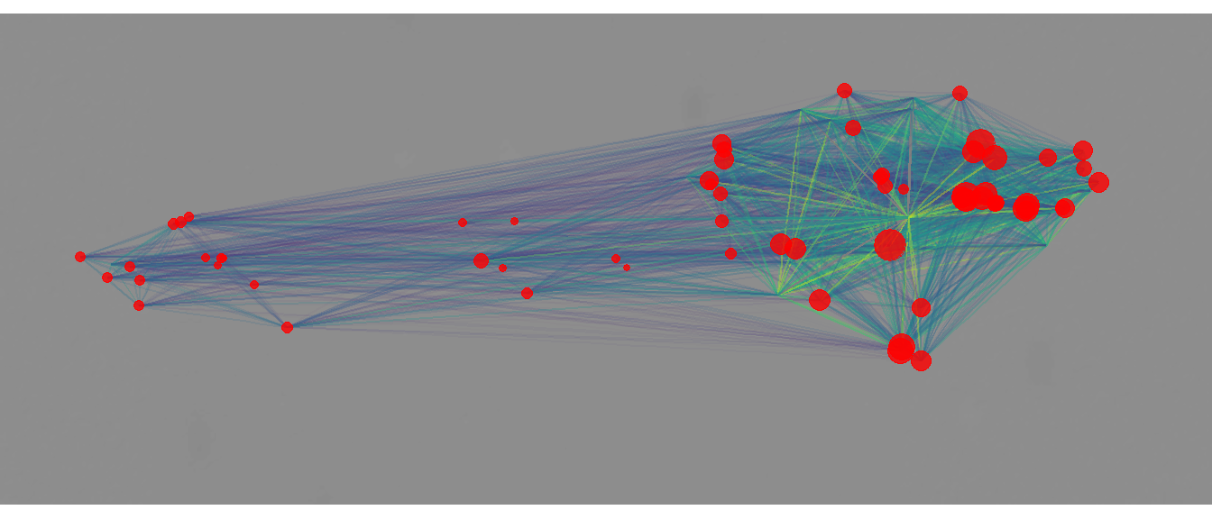
When we lower the B \(\beta\) parameter we get a stronger linear relationship between site area and flow. Further, when we look at the network, we see a more even degree distribution (though there are still nodes with higher degree) and more distributed edge weights across the network, though the high values are still. concentrated in the eastern cluster.
9.1.1 Parameterizing the Gravity Model
The simple model above uses just a single parameter \(\beta\) and is largely based on empirical information on the distance among settlements and their sizes. The basic assumption here is that larger sizes “attract” more flow and also have more flow to provide to other sites. Distance is also important and the \(\beta\) parameter determines the decay rate of distance as the plot below illustrates.
brk <- seq(0.01, 1, by = 0.01)
out <- as.data.frame(matrix(0, length(brk), 6))
out[, 1] <- brk

for (i in seq_len(length(brk))) {
  out[i, 2] <- exp(-brk[i])
  out[i, 3] <- exp(-brk[i] * 2)
  out[i, 4] <- exp(-brk[i] * 5)
  out[i, 5] <- exp(-brk[i] * 10)
  out[i, 6] <- exp(-brk[i] * 20)
}

colnames(out) <- c("beta", "D=1", "D=2", "D=5", "D=10", "D=20")

library(reshape2)
df <- melt(out[, 2:6])
df$beta <- rep(brk, 5)

ggplot(data = df) +
  geom_line(aes(x = beta, y = value, color = variable)) +
  ylab("Decay") +
  xlab(expression( ~ beta)) +
  theme_bw()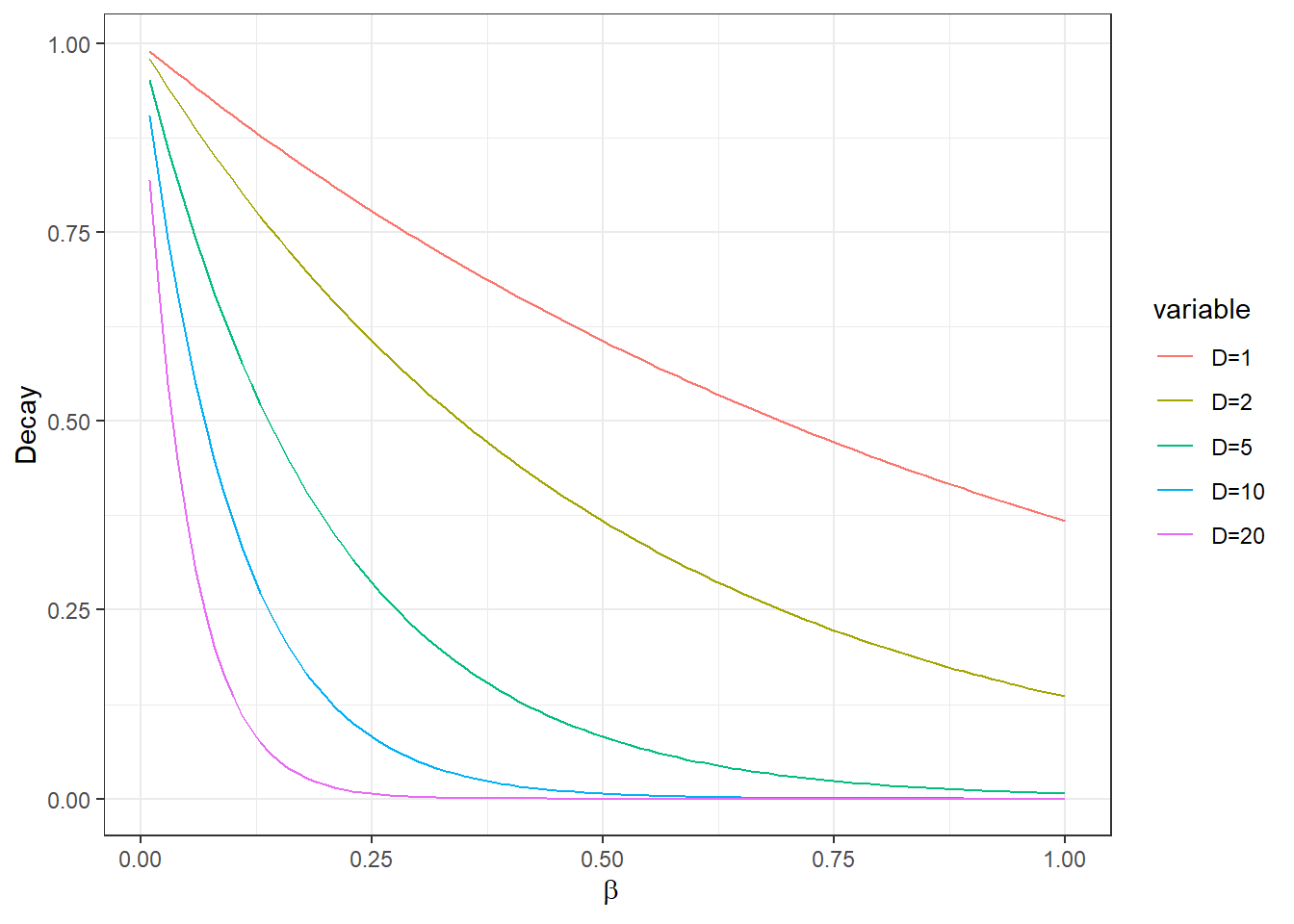
As we see in the plot above, the decay rate varies at different values of \(\beta\) and also in relation to the distance between points. How then, do we select the appropriate \(\beta\) in a model like this? There are a few ways to address this question depending on data availability and the nature of the issue such networks are being used to address. First, do we have some independent measure of network flow among our sites? For example, perhaps we could take information on the number or diversity of trade wares recovered at each site. We might expect sites with greater flow to have higher numbers or more diverse trade ware assemblages. We could evaluate this proposition using regression models and determine which \(\beta\) provides the best fit for the data and theory. Often, however, when we are working with simple gravity models we have somewhat limited data and cannot make such direct comparisons. It is possible that we have a theoretical expectation for the shape of the decay curve as shown above (note that distances could also be things like cost-distance here so perhaps we have a notion of maximal travel times or a caloric budget for movement) and we can certainly factor that into our model. As we will see below, however, there are alternatives to the simple gravity model that provide additional avenues for evaluating model fit.
9.2 The Rihll and Wilson “Retail” Model
One of the most popular extensions of the gravity model in archaeology was published by Rihll and Wilson in 1987 for their study of Greek city states in the 9th through 8th centuries B.C. They used a spatial interaction model that is sometimes called the “retail” model. This approach was originally designed for assessing the likely flows of resources into retail shops and how that can lead to shop growth/increased income and the establishment of a small number of super-centers that receive a large share of the overall available flow (often at the expense of smaller shops). When thinking about this model in a settlement context, the “flows” are people and resources and the growth of highly central nodes in the network is used to approximate the development of settlement hierarchy and the growth of large settlement centers.
One of the big advantages of this model is that it only requires the locations of origins and destinations and some measure of the cost of movement among sites. From that, an iterative approach is used to model the growth or decline of nodes based on their configurations in cost space and a couple of user provided parameters. Versions of this model have been used in a number of archaeological studies (e.g., Bevan and Wilson 2013; Evans and Rivers 2016; Filet 2017; Rihll and Wilson 1987). Here we present a version of the model inspired by the recent work by these scholars. The code below was based in part on an R function created as part of an ISAAKiel Summer School program.
Let’s first formally describe the Rihll and Wilson model. The model of interaction \(T_{ij}\) among a set of sites \(k\) can be represented as:
\[T_{ij} = \frac{O_iW_j^\alpha e^{-\beta c_{ij}}}{\Sigma_k W_k^\alpha e^{-\beta c_{jk}}}\]
where
- \(T_{ij}\) is the matrix of flows or interaction between nodes \(i\) and \(j\) (which may or may not be the same set)
- \(O_i\) is the estimated weight of flow or interaction out of the origins \(i\)
- \(W_j\) is the estimated weight of flow or interaction into the destinations \(j\). In most archaeological applications, this is used to represent some measurement of settlement size.
- \(\alpha\) is a parameter which defines the importance of resource flow into destinations. Numbers greater than 1 essentially model increasing returns to scale for every unit of flow.
- \(e^{-\beta c_{ij}}\) is the “deterrence” function where \(e\) is an exponential (\(exp(-\beta c_{ij})\)), \(c_ij\) is a measure of the cost of travel between nodes \(i\) and \(j\) and \(\beta\) is the decay parameter that describes the rate of decay in interaction at increasing distance.
- \(\Sigma_k W_k^\alpha e^{-\beta c_{jk}}\) is the sum for all nodes \(k\) of the expression using the \(W_j\), \(\alpha\), and deterrence function terms as described above.
In the case here (and in many archaeological examples) we start with a simple naive assumption of flow by setting all values of \(O\) and \(W\) equal to 1. Our goal, indeed, is to estimate \(W\) for all nodes iteratively. In order to do this after each calculation of \(T_{ij}\) we calculate two new values \(D_j\) and \(\Delta W_j\) defined as:
\[\begin{aligned} D_j & = \Sigma_i T_{ij}\\ \\ \Delta W_j & = \epsilon(D_j - KW_j) \end{aligned}\]
where
- \(D_j\) is a vector of values defined as the sum weights incident on a given node (column sums of \(T_{ij}\))
- \(\Delta W_j\) is the change in values of \(W\) (or estimated settlement size)
- \(\epsilon\) is a control parameter that determines how quickly \(W\) can change at each iterative step.
- \(K\) is a factor that is used to convert size \(W\) to the sum of flows \(D_j\)
For the purposes of our examples here, we set \(K\) to 1 to assume that sum of flows and size are in equal units and we set \(\epsilon\) to 0.01 so that the model does not converge too rapidly.
By way of example, we will use the original Greek city states data used by Rihll and Wilson (1987) and put online by Tim Evans based on his own work using these data and related spatial interaction models. Download the data here to follow along and download the Greece basemap here.
Let’s first map the Greek city states data.
library(sf)
library(ggmap)
load("data/greece.Rdata")

dat <- read.csv(file = "data/Rihll_Wilson.csv")
locs <-
  st_as_sf(dat,
           coords = c("Longitude_E", "Latitude_N"),
           crs = 4326)

ggmap(map) +
  geom_point(data = dat, aes(x = Longitude_E, y = Latitude_N)) +
  theme_void()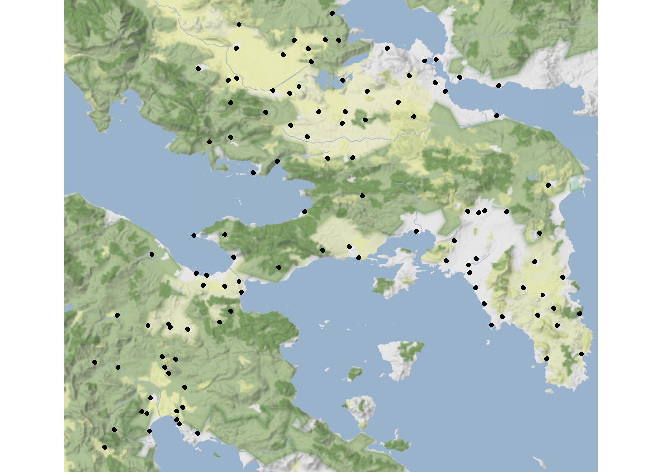
In the code below, we define a vector for the initial values of \(O_i\) and \(W_j\) setting the value to 1 for every site. We then define an initial \(\alpha = 1.05\) (to suggest that flows in provide slight increasing returns) and \(\beta = 0.1\) (which is a low decay rate such that long distance connections will retain some importance). The code then iteratively calculates values of \(T_{ij}\) until the sum of weights stops changing by more than some very low threshold for a number of time steps. In the chunk of code below we calculate \(T_{ij}\) and then plot histogram of \(W_j\) in final state of model.
# Set model parameters and initial variable states
Oi <- rep(1, nrow(dat))
Wj <- rep(1, nrow(dat))
alpha <- 1.05
beta <- 0.1
eps <- 0.01
K <- 1

# Define distance among points in kilometers. Because our
# points are in geographic coordinates we use the distm
# function. See the section on Spatial Networks for more.
library(geosphere)
d <- as.matrix(distm(dat[, c(7, 6)])) / 1000

# Dj is initial set as a vector of 1s like Wj
Dj <- Wj

# Create objects for keeping track of the number
# of iterations and the conditions required to end
# the loop.
end_condition <- 1
iter <- 0

# Define the deterrence function as a exponential
det <- exp(-beta * d)

# Create while loop that will continue to iterate Tij
# until 10,000 iterations or until the end_condition
# object is less than the threshold indicated.
while (!(end_condition < 1e-5) & iter < 10000) {
  # Set Wj to Dj
  Wj <- Dj
  # Calculate Tij as indicated above
  Tij <-
    apply(det * Oi %o% Wj ^ alpha, 2, '/',
          (Wj ^ alpha %*% det))
  # Calculate change in W using equation above
  delta_W <- eps * (colSums(Tij) - (K * Wj))

  # Calculate new Dj
  Dj <- delta_W + Wj

  # Add to iterator and check for end conditions
  iter <- iter  + 1
  end_condition <- sum((Dj - Wj) ^ 2)
}

hist(Wj, breaks = 15)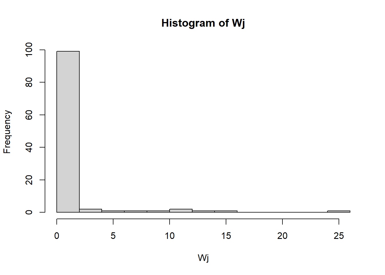
As this shows, the Rihll and Wilson model generates flow weights with a heavy tailed distribution with these parameters. This means that a small number of nodes are receiving lots of flow but most are receiving very little.
In order to look at this geographically, Rihll and Wilson defined what they call “Terminal Sites”. Terminal sites in the network are nodes where the total flow of inputs into the site \(Wj\) is bigger than the largest flow out of the site. Let’s define our terminal sites for our model run above and then examine them.
terminal_sites <- NULL
for (i in 1:109) terminal_sites[i] <- sum(Tij[-i, i]) > max(Tij[i, ])

knitr::kable(dat[terminal_sites,])| SiteID | ShortName | Name | XPos | YPos | Latitude_N | Longitude_E | |
|---|---|---|---|---|---|---|---|
| 14 | 13 | 14 | Aulis | 0.6366255 | 0.2547325 | 38.40000 | 23.60000 |
| 18 | 17 | 18 | Onchestos | 0.3962963 | 0.2967078 | 38.37327 | 23.15027 |
| 22 | 21 | 22 | Alalkomenai | 0.3098765 | 0.2860082 | 38.41000 | 22.98600 |
| 25 | 24 | 25 | Thebes | 0.4876543 | 0.3197531 | 38.32872 | 23.32191 |
| 45 | 44 | 45 | Megara | 0.5098765 | 0.5197531 | 38.00000 | 23.33333 |
| 50 | 49 | 50 | Menidi | 0.7255144 | 0.4761317 | 38.08333 | 23.73333 |
| 56 | 55 | 56 | Markopoulo | 0.8415638 | 0.5740741 | 37.88333 | 23.93333 |
| 70 | 69 | 70 | Athens | 0.7164609 | 0.5320988 | 37.97153 | 23.72573 |
| 78 | 77 | 78 | Kromna | 0.3098765 | 0.5823045 | 37.90479 | 22.94820 |
| 80 | 79 | 80 | Lekhaion | 0.2777778 | 0.5666667 | 37.93133 | 22.89293 |
| 97 | 96 | 97 | Prosymnia | 0.2119342 | 0.7074074 | 37.70555 | 22.76298 |
| 101 | 100 | 101 | Argos | 0.1930041 | 0.7444444 | 37.63092 | 22.71955 |
| 103 | 102 | 103 | Magoula | 0.1773663 | 0.7740741 | 37.59310 | 22.70769 |
| 104 | 103 | 104 | Tiryns | 0.2349794 | 0.7748971 | 37.59952 | 22.79959 |
Interesting, our terminal sites include many historically important and larger centers (such as Athens, Thebes, and Megara), despite the fact that we included no information about size in our model.
Now let’s map them. Points are scaled based on the weight of inflow and terminal sites are colored in blue.
ggmap(map) +
  geom_point(
    data = dat,
    aes(
      x = Longitude_E,
      y = Latitude_N,
      size = Wj,
      color = terminal_sites
    ),
    show.legend = FALSE
  ) +
  theme_void()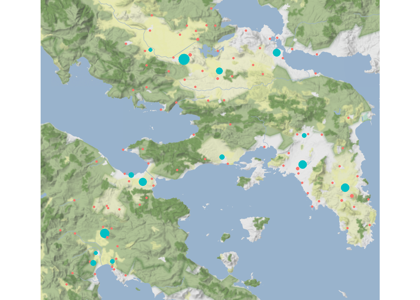
As this map illustrates, the terminal sites are roughly evenly distributed across the study area rather than clustered together. Now, let’s see what happens when we vary our parameters \(\alpha\) and \(\beta\).
For the next map, we will set \(alpha = 1.15\) and leave \(\beta\) as is. To make it easier to calculate everything, we’re going to call an R script using source() that includes the full function and outputs \(W_j\), \(T_{ij}\), the number of iterations, and a logical vector indicating which nodes are terminals.
source("scripts/rihll_wilson.R")

rw2 <- rihll_wilson(alpha = 1.15, beta = 0.1, dist_mat = d)

ggmap(map) +
  geom_point(
    data = dat,
    aes(
      x = Longitude_E,
      y = Latitude_N,
      size = rw2$Wj,
      color = rw2$terminals
    ),
    show.legend = FALSE
  ) +
  theme_void()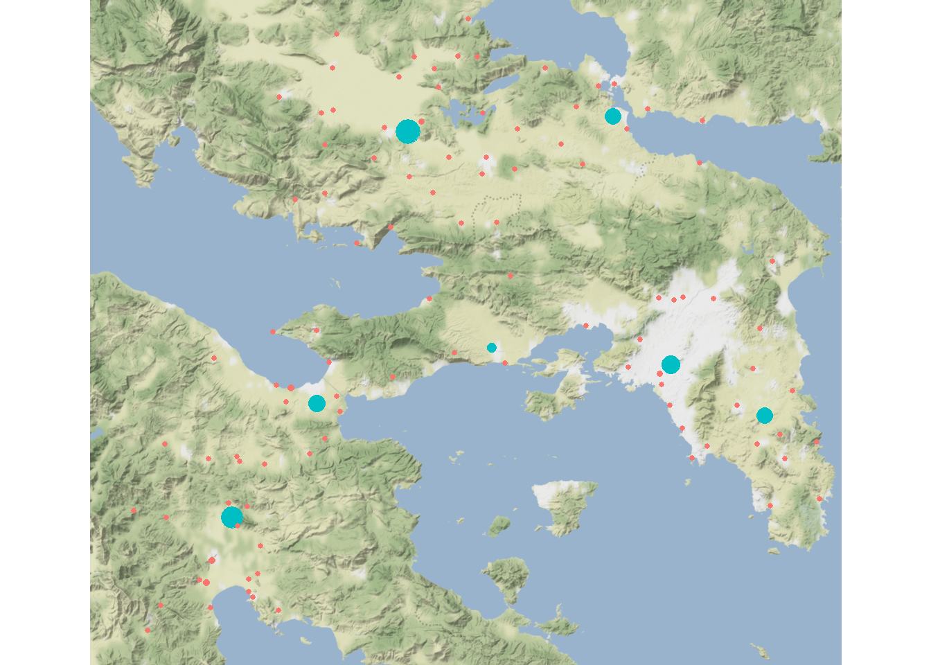
knitr::kable(dat[rw2$terminals,])| SiteID | ShortName | Name | XPos | YPos | Latitude_N | Longitude_E | |
|---|---|---|---|---|---|---|---|
| 14 | 13 | 14 | Aulis | 0.6366255 | 0.2547325 | 38.40000 | 23.60000 |
| 18 | 17 | 18 | Onchestos | 0.3962963 | 0.2967078 | 38.37327 | 23.15027 |
| 45 | 44 | 45 | Megara | 0.5098765 | 0.5197531 | 38.00000 | 23.33333 |
| 56 | 55 | 56 | Markopoulo | 0.8415638 | 0.5740741 | 37.88333 | 23.93333 |
| 70 | 69 | 70 | Athens | 0.7164609 | 0.5320988 | 37.97153 | 23.72573 |
| 78 | 77 | 78 | Kromna | 0.3098765 | 0.5823045 | 37.90479 | 22.94820 |
| 97 | 96 | 97 | Prosymnia | 0.2119342 | 0.7074074 | 37.70555 | 22.76298 |
Increasing \(\alpha\) increases the importance of inflow so we end up with fewer terminal sites. Notably, we are still retaining many large and historically important cities despite not including information on site size in our model.
Now let’s set \(\alpha = 1.05\) and increase \(\beta = 0.35\):
rw3 <- rihll_wilson(alpha = 1.05, beta = 0.35, dist_mat = d)

ggmap(map) +
  geom_point(
    data = dat,
    aes(
      x = Longitude_E,
      y = Latitude_N,
      size = rw3$Wj,
      color = rw3$terminals
    ),
    show.legend = FALSE
  ) +
  theme_void()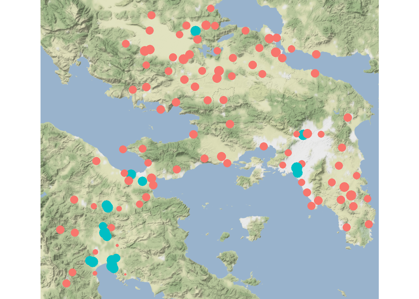
knitr::kable(dat[rw3$terminals,])| SiteID | ShortName | Name | XPos | YPos | Latitude_N | Longitude_E | |
|---|---|---|---|---|---|---|---|
| 4 | 3 | 4 | Ay.Marina | 0.4267490 | 0.2201646 | 38.48208 | 23.20793 |
| 50 | 49 | 50 | Menidi | 0.7255144 | 0.4761317 | 38.08333 | 23.73333 |
| 68 | 67 | 68 | Phaleron | 0.6958848 | 0.5650206 | 37.93731 | 23.70625 |
| 71 | 70 | 71 | Kallithea | 0.7074074 | 0.5419753 | 37.95589 | 23.70209 |
| 78 | 77 | 78 | Kromna | 0.3098765 | 0.5823045 | 37.90479 | 22.94820 |
| 80 | 79 | 80 | Lekhaion | 0.2777778 | 0.5666667 | 37.93133 | 22.89293 |
| 88 | 87 | 88 | Kleonai | 0.2168724 | 0.6341564 | 37.81142 | 22.77429 |
| 90 | 89 | 90 | Zygouries | 0.2316872 | 0.6489712 | 37.80300 | 22.78015 |
| 95 | 94 | 95 | Mykenai | 0.2069959 | 0.6884774 | 37.73079 | 22.75638 |
| 97 | 96 | 97 | Prosymnia | 0.2119342 | 0.7074074 | 37.70555 | 22.76298 |
| 98 | 97 | 98 | Argive_Heraion | 0.2185185 | 0.7172840 | 37.69194 | 22.77472 |
| 100 | 99 | 100 | Pronaia | 0.2333333 | 0.7880658 | 37.57682 | 22.79954 |
| 102 | 101 | 102 | Kephalari | 0.1609054 | 0.7666667 | 37.59736 | 22.69123 |
| 103 | 102 | 103 | Magoula | 0.1773663 | 0.7740741 | 37.59310 | 22.70769 |
| 104 | 103 | 104 | Tiryns | 0.2349794 | 0.7748971 | 37.59952 | 22.79959 |
| 105 | 104 | 105 | Prof.Elias | 0.2514403 | 0.7683128 | 37.60818 | 22.81920 |
| 106 | 105 | 106 | Nauplia | 0.2292181 | 0.7946502 | 37.56812 | 22.80871 |
As this map illustrates, increasing \(\beta\) increases the distance decay meaning that local interactions are more important leading to a more even distribution of \(W_j\) values and more terminal sites (which are further somewhat spatially clustered).
9.2.1 Parameterizing the Retail Model
How might we select appropriate values for \(\alpha\) and \(\beta\) in our model? The approach Rihll and Wilson and many subsequent researchers have taken (see Bevan and Wilson 2013; Filet 2017) is to use our knowledge of the archaeological record and regional settlement patterns and to select a model that is most consistent with that knowledge. Our model creates more or fewer highly central nodes depending on how we set our parameters. As we noted above, the terminal nodes we defined consistently include historically important and large sites like Athens suggesting that our model is likely doing something reasonable. One potential approach would be to run comparisons for a plausible range of values for \(\alpha\) and \(\beta\) and to evaluate relationships with our own archaeological knowledge of settlement hierarchy and which sites/places are defined as terminal sites or highly central places in our model.
In order to test a broader range of parameter values and their impact on the number of terminal sites, we have created a function that takes the parameters, data, and distance matrix and outputs just the number of terminals.
Let’s run this for a range of plausible parameter values:
If you attempt to run this on your own note that it takes quite a while to complete.
source("scripts/terminals_by_par.R")

alpha_ls <- seq(0.90, 1.25, by = 0.01)
beta_ls <- seq(0.05, 0.40, by = 0.01)

res <- matrix(NA, length(alpha_ls), length(beta_ls))
row.names(res) <- alpha_ls
colnames(res) <- beta_ls

for (i in seq_len(length(alpha_ls))) {
  for (j in seq_len(length(beta_ls))) {
    res[i, j] <-
      terminals_by_par(
        alpha = alpha_ls[i],
        beta = beta_ls[j],
        dist_mat = d
      )
  }
}
In case you want to see the data but don’t want to wait for the above chunk to run, we have created an Rdata object with the output. Let’s load those data and plot them as a heat map/tile plot:
## Warning: package 'ggraph' was built under R version 4.2.3
res_df <- melt(res)

ggplot(data = res_df) +
  geom_tile(aes(x = Var2, y = Var1, fill = value)) +
  scale_fill_viridis(option = "turbo") +
  xlab(expression( ~ beta)) +
  ylab(expression( ~ alpha)) +
  theme_bw()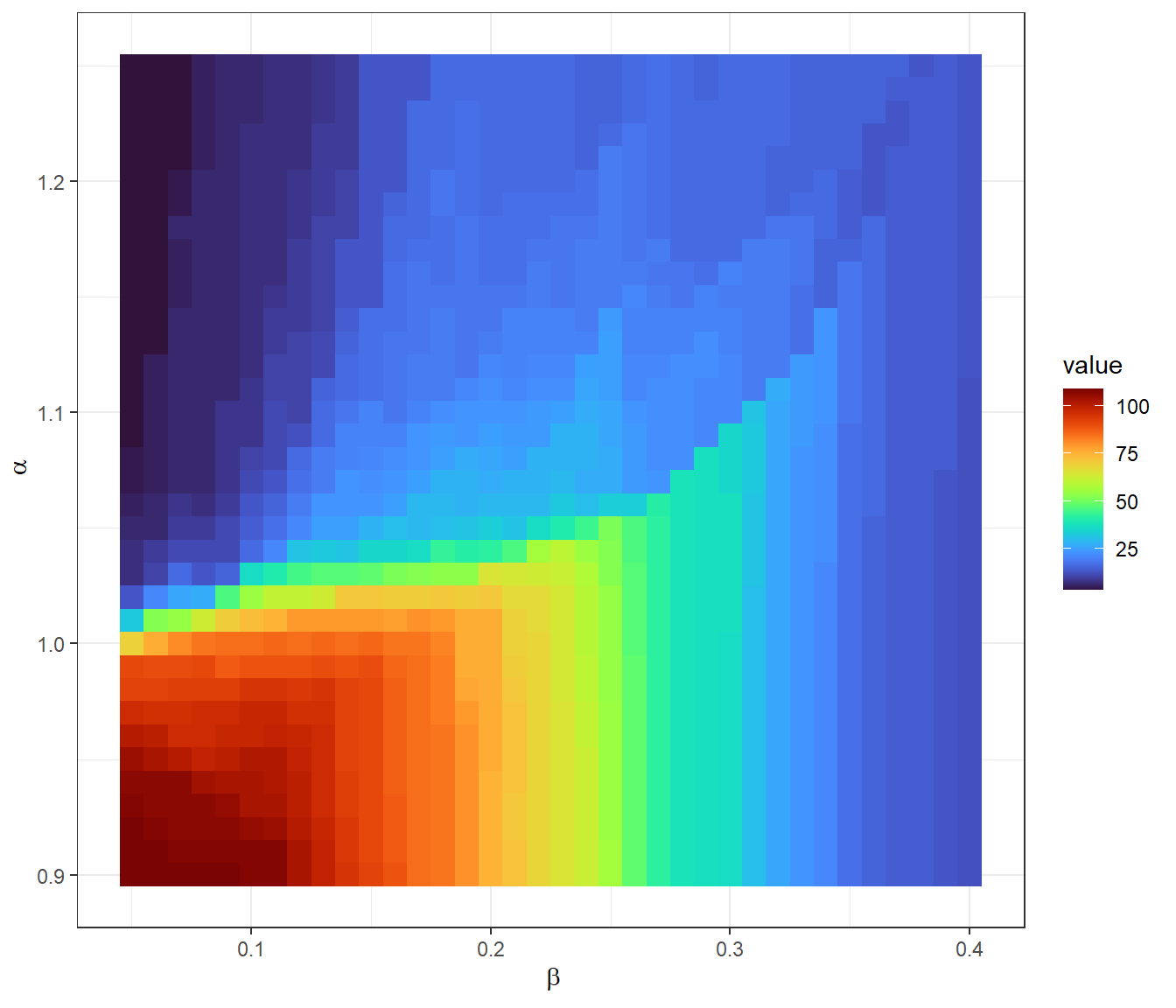
As this plot shows low values for both \(\alpha\) and \(\beta\) tend to generate networks with lots of terminals but the relationship between these parameters is not linear. Based on this and our knowledge of the archaeological record, we could make an argument for evaluating a particular combination of parameters but there is certainly no single way to make that decision. To see further expansions of such an approach that attempts to deal with incomplete survey data and other kinds of considerations of settlement prominence, see the published example by Bevan and Wilson (2013).
9.3 Truncated Power Functions
Another similar spatial interaction model was used in a study by Menze and Ur (2012) in their exploration of networks in northern Mesopotamia. Their model is quite similar to the simple gravity model we saw above but with a couple of additional parameters and constraints. We leave the details of the approach to the published article but briefly describe their model here. This truncated power function requires information on settlement location, some measure of size or “attraction,” and three parameter values. Edge interaction \(E_{ij}\) in this model can be formally defined as:
\[E_{ij}(\alpha,\beta,\gamma) = V_i^\gamma V_j^\gamma d_{ij}^{-\alpha} e^{(-d_{ij}/\beta)}\]
where
- \(V\) is some measure of the attractiveness of node \(i\) or \(j\), typically defined in terms of settlement size.
- \(d_{ij}\) is the distance between nodes \(i\) and \(j\). Again, this can use measures of distance other than simple Euclidean distances.
- \(\alpha\) is a constraint on the distance between nodes.
- \(\beta\) is the physical distance across which distance decay should be considered (defined in units of \(d\)).
- \(\gamma\) is used to define the importance of \(V\) on interaction where values above 1 suggest increasing returns to scale.
The model output \(E_{ij}\) is, according to Menze and Ur, meant to approximate the movement of people among nodes across the landscape. In order to evaluate this function, we replicate the results of the Menze and Ur paper with one small change. We drop the bottom 50% smallest sites from consideration due to the large sample size to keep run times manageable (but this could certainly be changed in the code below). We use the replication data set provided by Menze and Ur online here.
Let’s read in the data, omit the rows without site volume estimates, and then remove the lowest 50% of sites in terms of volume values. We then plot the sites with points scaled by site volume. Download the data here to follow along.
mesop <- read.csv("data/menze_ur_sites.csv")
mesop <- mesop[-which(is.na(mesop$volume)),]
mesop <- mesop[which(mesop$volume > quantile(mesop$volume, 0.5)),]

ggplot(mesop) +
  geom_point(aes(x = x, y = y, size = volume),
             show.legend = FALSE) +
  scale_size_continuous(range = c(1, 3)) +
  theme_void()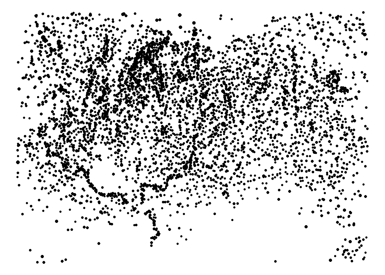
And here we implement the truncated power approach rolled into a function called truncated_power. We use the values selected as optimal for the Menze and Ur (2012) paper.
Note that the block below takes several minutes to run.
d <- as.matrix(dist(mesop[, 1:2])) / 1000

truncated_power <- function (V, d, a, y, B) {
  temp <- matrix(0, nrow(d), ncol(d))
  for (i in seq_len(nrow(d))) {
    for (j in seq_len(ncol(d))) {
      temp[i, j] <- V[i] ^ y * V[j] ^ y * d[i, j] ^ -a * exp(-d[i, j] / B)
      if (temp[i, j] == Inf) {
        temp[i, j] <- 0
      }
    }
  }
  return(temp)
}

res_mat <- truncated_power(V = mesop$volume, d = d, a = 1, y = 1, B = 4)
We can now plot the sites again, this time with points scaled based on the total volume of flow incident on each node.
edge_flow <- rowSums(res_mat)

ggplot(mesop) +
  geom_point(aes(
    x = x,
    y = y,
    size = edge_flow,
    alpha = edge_flow
  ),
  show.legend = FALSE) +
  scale_size_continuous(range = c(1, 3)) +
  theme_void()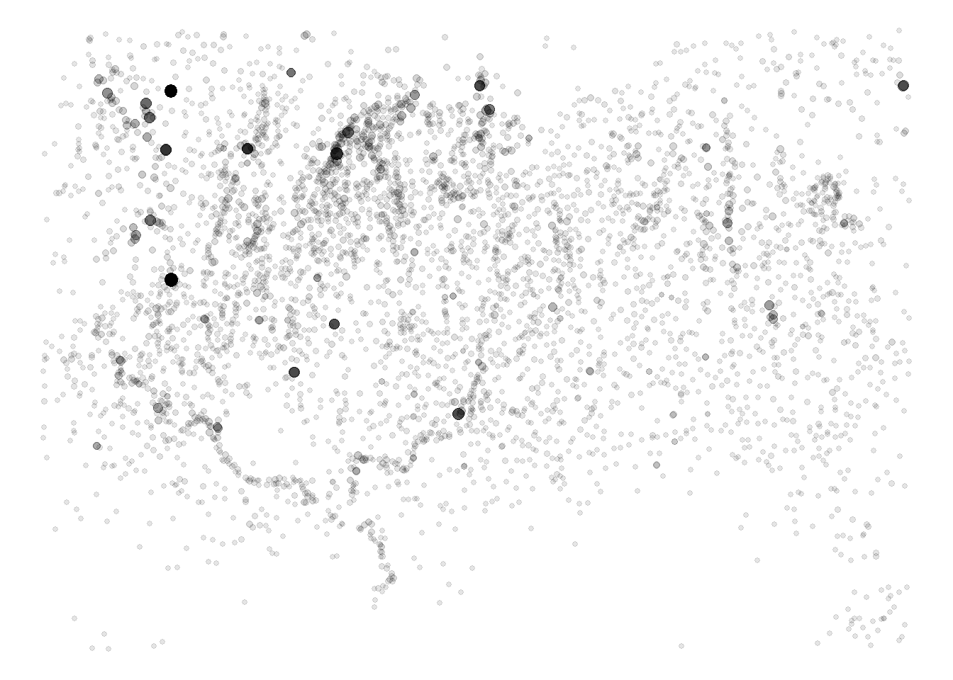
If we compare the plot above to figure 8 in Menze and Ur (2012) we see highly central sites in the same locations suggesting that we’ve reasonably approximated their results even though we are using a slightly different sample. Further, as the next plot shows, if we remove the few sites that are isolated in our sample (due to us removing the bottom 50% of sites) we also see the same strong linear correlation between the log of site volume and the log of our measure of interaction.
rem_low <- which(edge_flow > quantile(edge_flow, 0.01))

library(ggplot2)
library(scales)
df <- data.frame(Volume = mesop$volume[rem_low], Interaction = edge_flow[rem_low])

ggplot(data = df) +
  geom_point(aes(x = Volume, y = Interaction)) +
  scale_x_log10(
    breaks = trans_breaks("log10", function(x)
      10 ^ x),
    labels = trans_format("log10", math_format(10 ^ .x))
  ) +
  scale_y_log10(
    breaks = trans_breaks("log10", function(x)
      10 ^ x),
    labels = trans_format("log10", math_format(10 ^ .x))
  ) +
  theme_bw()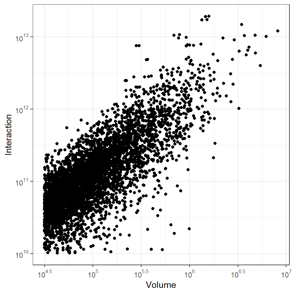
We could go about parameterizing this truncated power function in much the same way that we saw with the models above (i.e., testing values and evaluating results against the archaeological pattern). Indeed that is what Menze and Ur do but with a slight twist on what we’ve seen so far. In their case, they are lucky enough to have remotely sensed data on actual trails among sites for some portion of their study area. How they selected model parameters is by testing a range of values for all parameters and selecting the set that produced the closest match between site to site network edges and the orientations of actual observed trails (there are some methodological details I’m glossing over here so refer to the article for more). As this illustrates, there are many potential ways to select model parameters based on empirical information.
9.4 Radiation Models
In 2012 Filippo Simini and colleagues (Simini et al. 2012) presented a new model, designed specifically to model human geographic mobility called the radiation model. This model was created explicitly as an alternative to various gravity models and, in certain cases, was demonstrated to generate improved empirical predictions of human population movement between origins and destinations. This model shares some basic features with gravity models but importantly, the approach includes no parameters at all. Instead, this model uses simply measures of population at a set of sites and the distances between them. That is all that is required so this model is relatively simple and could likely be applied in many archaeological cases. Let’s take a look at how it is formally defined:
\[T_{ij} = T_i \frac{m_in_j}{(m_i + s_{ij})(m_i + n_j + s_{ij})}\]
where
- \(T_i\) is the total number of “commuters” or migrating individuals from node \(i\).
- \(m_i\) and \(n_j\) are the population estimates of nodes \(i\) and \(j\) respectively.
- \(s_{ij}\) is the total population in a circle centered at node \(i\) and touching node \(j\) excluding the populations of both \(i\) and \(j\).
We have defined a function for calculating radiation among a set of sites using just two inputs:
-
popis a vector of population values. -
d_matis a distance matrix among all nodes.
A script containing this function can also be downloaded here
radiation <- function(pop, d_mat) {
  ## create square matrix with rows and columns for every site
  out <-
    matrix(0, length(pop), length(pop))
  for (i in seq_len(length(pop))) {
    #  start loop on rows
    for (j in seq_len(length(pop))) {
      # start loop on columns
      if (i == j)
        next()
      # skip diagonal of matrix
      m <- pop[i] # set population value for site i
      n <- pop[j] # set population value for site j
      # find radius as distance between sites i and j
      r_ij <-
        d_mat[i, j]
      # find all sites within the distance from i to j centered on i
      sel_circle <-
        which(d_mat[i, ] <= r_ij)
      # remove the site i and j from list
      sel_circle <-
        sel_circle[-which(sel_circle %in% c(i, j))]
      s <- sum(pop[sel_circle]) # sum population within radius
      # calculate T_i and output to matrix
      temp <-
        pop[i] * ((m * n) / ((m + s) * (m + n + s)))
      if (is.na(temp)) temp <- 0
      out[i, j] <- temp
    }
  }
  return(out)
}
In order to test this model, we will use the same Wankarani settlement data we used above for the simple gravity model. We will use site area divided by 500 as our proxy for population here. Again we limit our sample to Late Intermediate period sites and habitations. Download the data here to follow along.
wankarani <- read.csv("data/Wankarani_siteinfo.csv")
wankarani <- wankarani[which(wankarani$Period == "Late Intermediate"), ]
wankarani <- wankarani[which(wankarani$Type == "habitation"), ]

d <- as.matrix(dist(wankarani[, 5:6]))

rad_test <- radiation(pop = wankarani$Area / 500, d_mat = d)
Now let’s plot the resulting network with each node scaled by the total incident flow (row sums of the output of the function above). We plot network edges with weights indicated by color (blue indicates low weight and yellow indicates high weight).
library(igraph)
library(ggraph)
library(sf)
library(ggmap)

load("data/bolivia.Rdata")

locations_sf <-
  st_as_sf(wankarani, coords = c("Easting", "Northing"), crs = 32721)
loc_trans <- st_transform(locations_sf, crs = 4326)
coord1 <- do.call(rbind, st_geometry(loc_trans)) %>%
  tibble::as_tibble() %>%
  setNames(c("lon", "lat"))

xy <- as.data.frame(coord1)
colnames(xy) <- c("x", "y")


net <-
  graph_from_adjacency_matrix(rad_test, mode = "undirected",
                              weighted = TRUE)

# Extract edge list from network object
edgelist <- get.edgelist(net)

# Create data frame of beginning and ending points of edges
edges <-
  data.frame(xy[edgelist[, 1], ],
             xy[edgelist[, 2], ])
colnames(edges) <- c("X1", "Y1", "X2", "Y2")

# Calculate weighted degree
dg <- rowSums(rad_test)

# Plot data on map
ggmap(base_bolivia, darken = 0.35) +
  geom_segment(
    data = edges,
    aes(
      x = X1,
      y = Y1,
      xend = X2,
      yend = Y2,
      col = log(E(net)$weight),
      alpha = log(E(net)$weight)
    ),
    show.legend = FALSE
  ) +
  scale_alpha_continuous(range = c(0, 0.5)) +
  scale_color_viridis() +
  geom_point(
    data = xy,
    aes(x, y, size = dg),
    alpha = 0.8,
    color = "red",
    show.legend = FALSE
  ) +
theme_void() 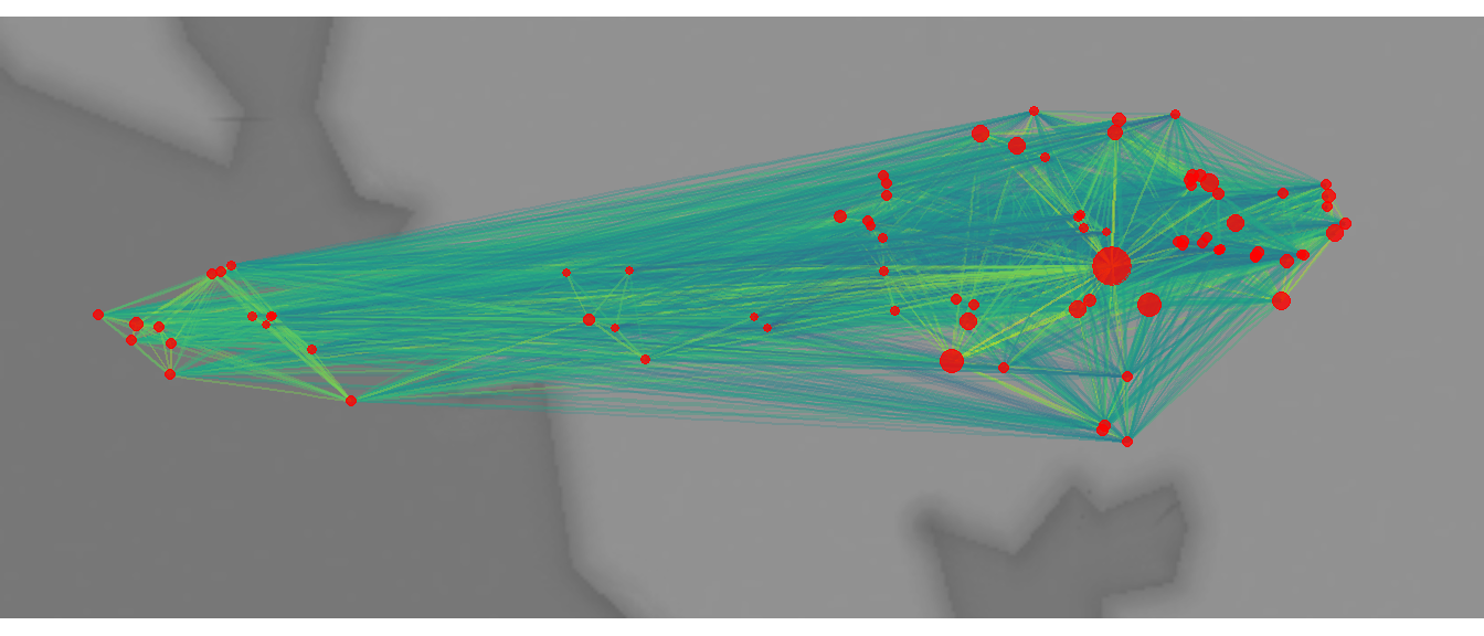
This map shows clusters of higher and lower edge weights and again variation in total weighted degree (with higher values in the east). The results are similar, but not identical to the output of the simple gravity model.
dg_grav <-  rowSums(grav_mod(
  attract = wankarani$Area / 1000,
  B = 1,
  d = d_mat
))

dg_rad <- rowSums(rad_test)

library(ggplot2)
library(scales)
df <-
  data.frame(Radiation = dg_rad, Gravity = dg_grav)

ggplot(data = df) +
  geom_point(aes(x = Radiation, y = Gravity)) +
  scale_x_log10(
    breaks = trans_breaks("log10", function(x)
      10 ^ x),
    labels = trans_format("log10", math_format(10 ^ .x))
  ) +
  scale_y_log10(
    breaks = trans_breaks("log10", function(x)
      10 ^ x),
    labels = trans_format("log10", math_format(10 ^ .x))
  ) +
  theme_bw()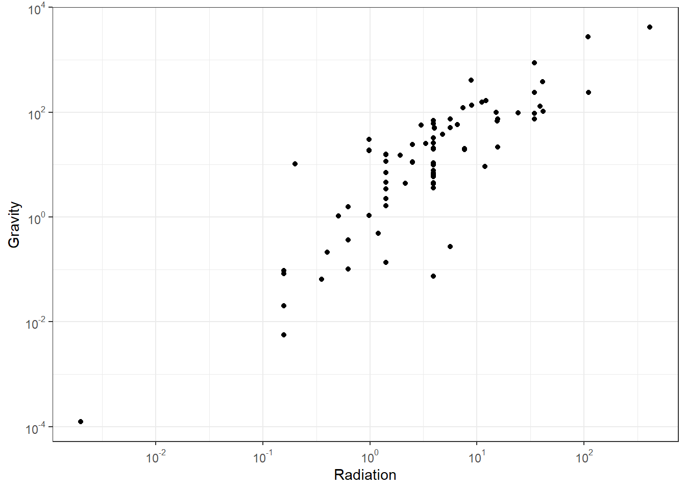
We are aware of few published examples of the use of radiation models for archaeological cases, but there is certainly potential (see Evans 2016).
9.5 Other Spatial Interaction Models
There are many other spatial interaction models we haven’t covered here. Most are fairly similar in that they take information on site size, perhaps other relevant archaeological information, and a few user selected parameters to model flows across edges and sometimes to iteratively predict sizes of nodes, the weights of flows, or both. Other common models we haven’t covered here include the XTENT model (Renfrew and Level 1979; see Ducke and Suchowska 2021 for an example with code for GRASS GIS) and various derivations of MaxEnt (or maximum entropy) models. Another approach that merits mention here is the ariadne model designed by Tim Evans and used in collaboration with Ray Rivers, Carl Knappett, and others. This model provides a means for predicting site features and estimating optimal networks based on location and very general size information (or other archaeological features). This model has features that make it particularly useful for generating directed spatial networks (see Evans et al. 2011). Although there is a basic R implementation for the ariadne model developed by the ISAAKiel team available here the computational constraints make this function unfeasible in R for all but very small networks. Instead, if you are interested in applying the ariadne model, we suggest you use the original Java program created by Tim Evans and available here.